
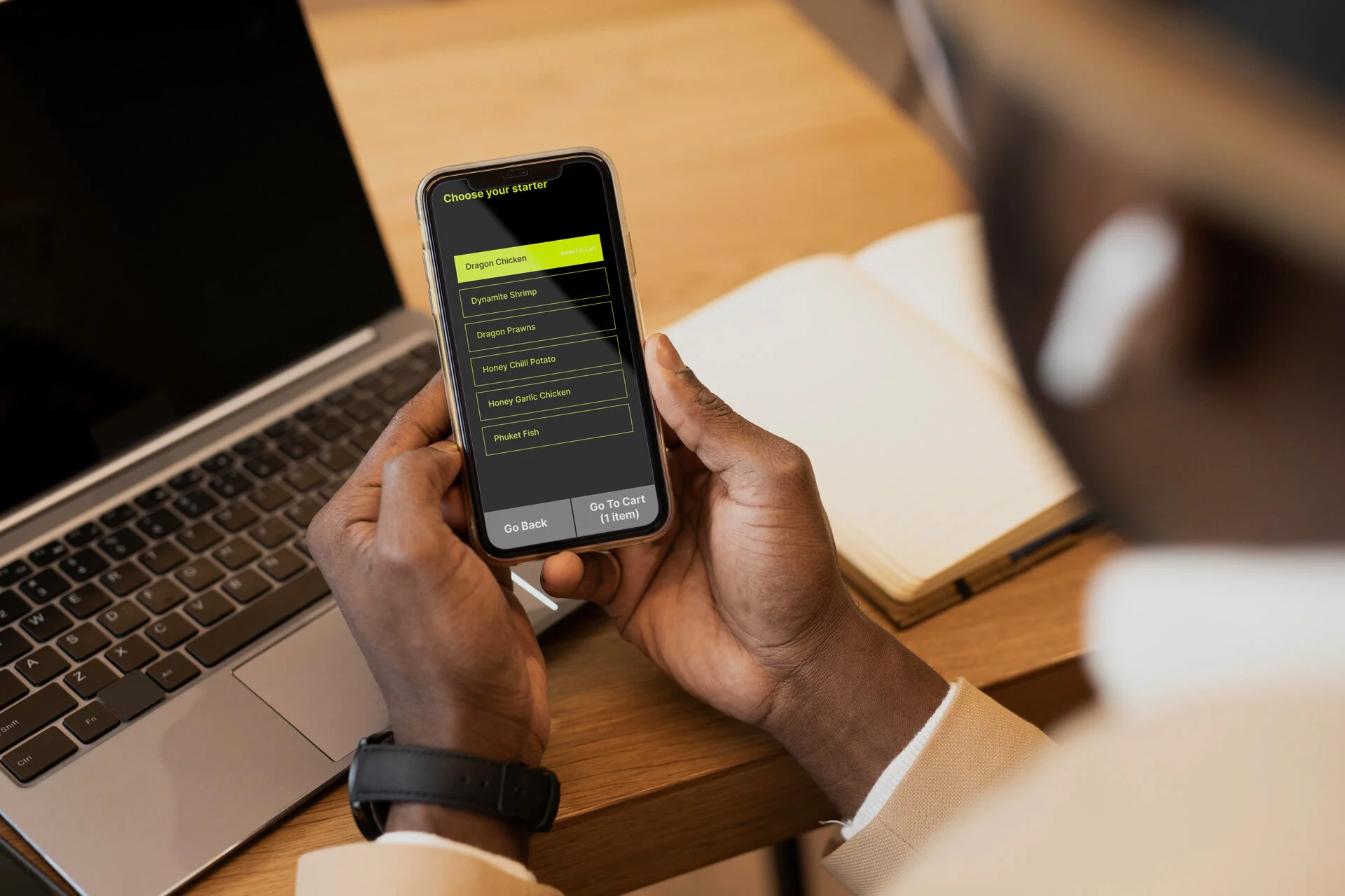
A Food Delivery App for People Who are Blind
As part of my Google UX Certification Program, in the design for social good section, I chose the prompt that asked me to design a food delivery service for people who are blind. With my interest in exploring further about accessibility design, I was able to learn much more about accessibility features in-built in our devices, and how technology can be designed to be all-inclusive.
Project Overview
The problem:
Not many food delivery apps are visually challenged friendly. Nor are they supported by the device’s accessibility options.
The goal:
To design a service that will help people who are blind to order food supported by their Android phone’s accessibility options
My role:
Research & UX Design
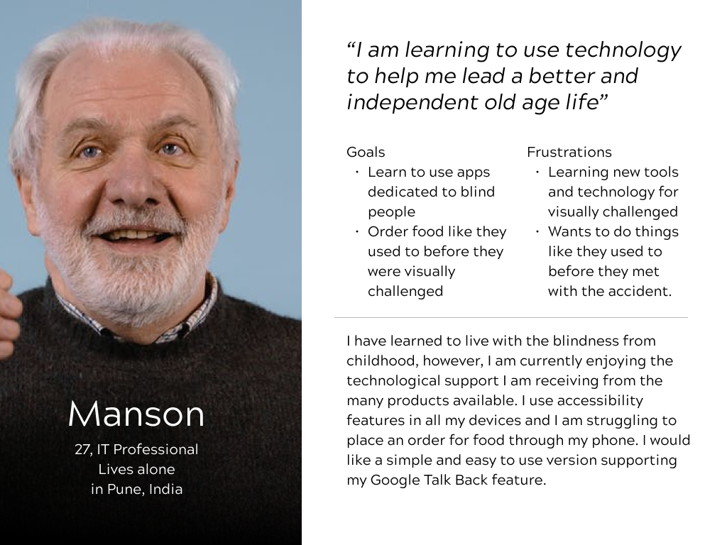
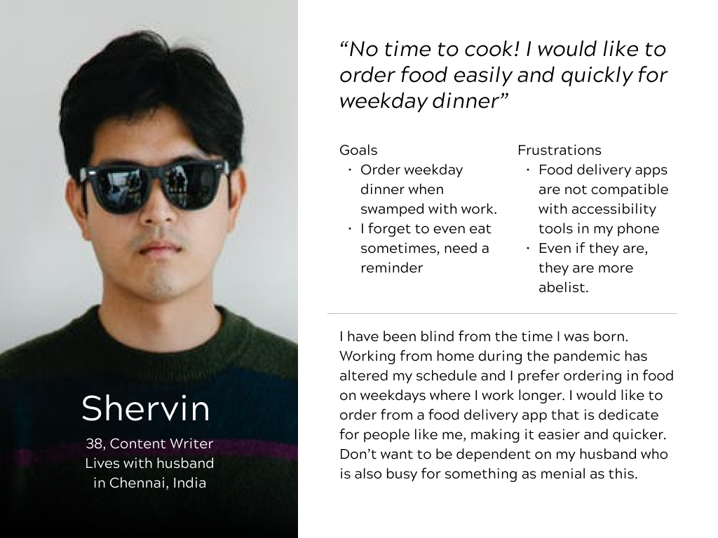
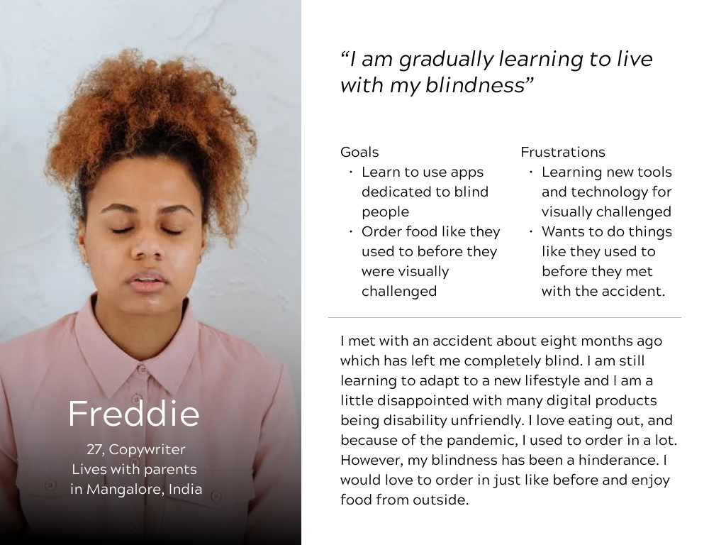
User Personas

I used the google talk back feature to interact with my phone for a week to understand how it works. I did a survey with 3 people who are visually challenged to understand what features they use and how they use them to interact with their phones.
I interacted with them to understand what features they use- for example, one of the users was not completely blind, but they require a high contrast screen to place an order.
The app should be able to be supported by a braille keyboard so that they can type in and search or add comments to their order after placing it.

I used these inputs to come up with some paper sketches of wireframes to proceed with creating the wireframes on Figma.
I also tested paper prototypes by speaking like the Google Talk Back feature with the visually challenged person to learn if the prototype works.
Through this usability study, I understood:
a. There is no need to redesign or come up with an entirely new app for the visually challenged.
b. An existing app can be redesigned to be more accessible.
c. The copy and the content must also be supportive of accessibility.
d. Information Architecture must also be in line with accessibility features.
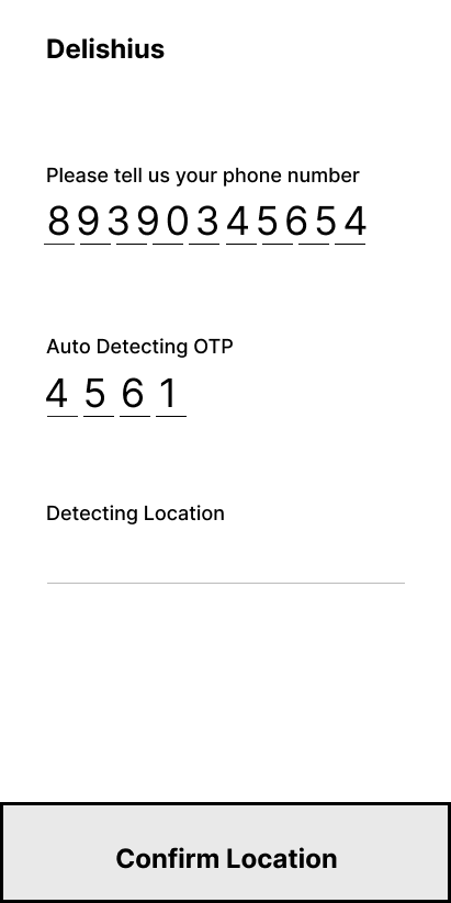
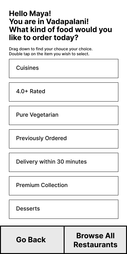
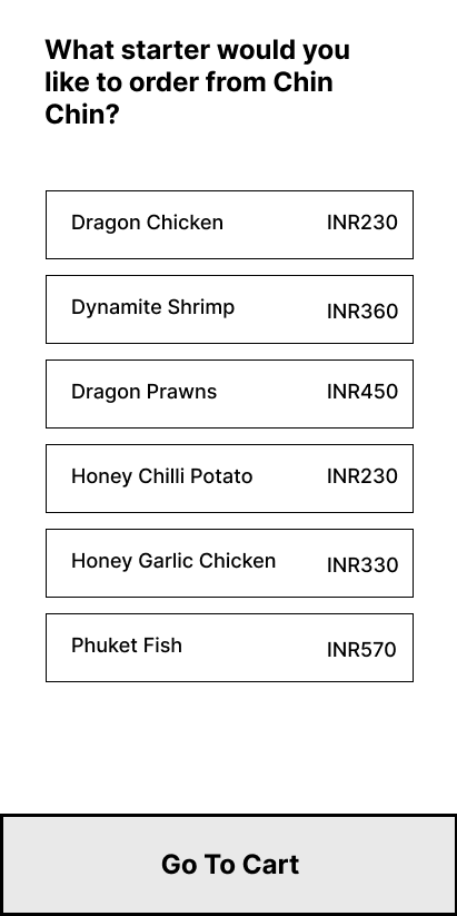
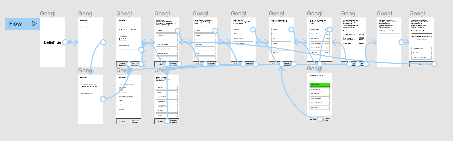
Affinity Mapping from the Usability Test Conducted with the LoFi Prototypes.
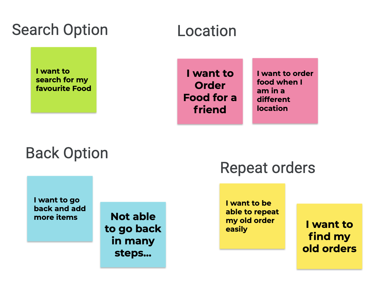
The LoFi Prototype was tested on two participants who are visually challenged. The study was synthesised and the insights were prioritised as P0 and P1. Findings were as below.
In terms of heuristics, the user control was missing. It was difficult to go back to a previous step and edit the items added to cart.
Keeping ease of use in mind, there was no way for a user to go back and repeat an order. Freedom to repeat an old order was missing.
Although it is easier to use location access and use the location of the user to display restaurants, there was no way for the user to change their location. This feature is to be incorporated.
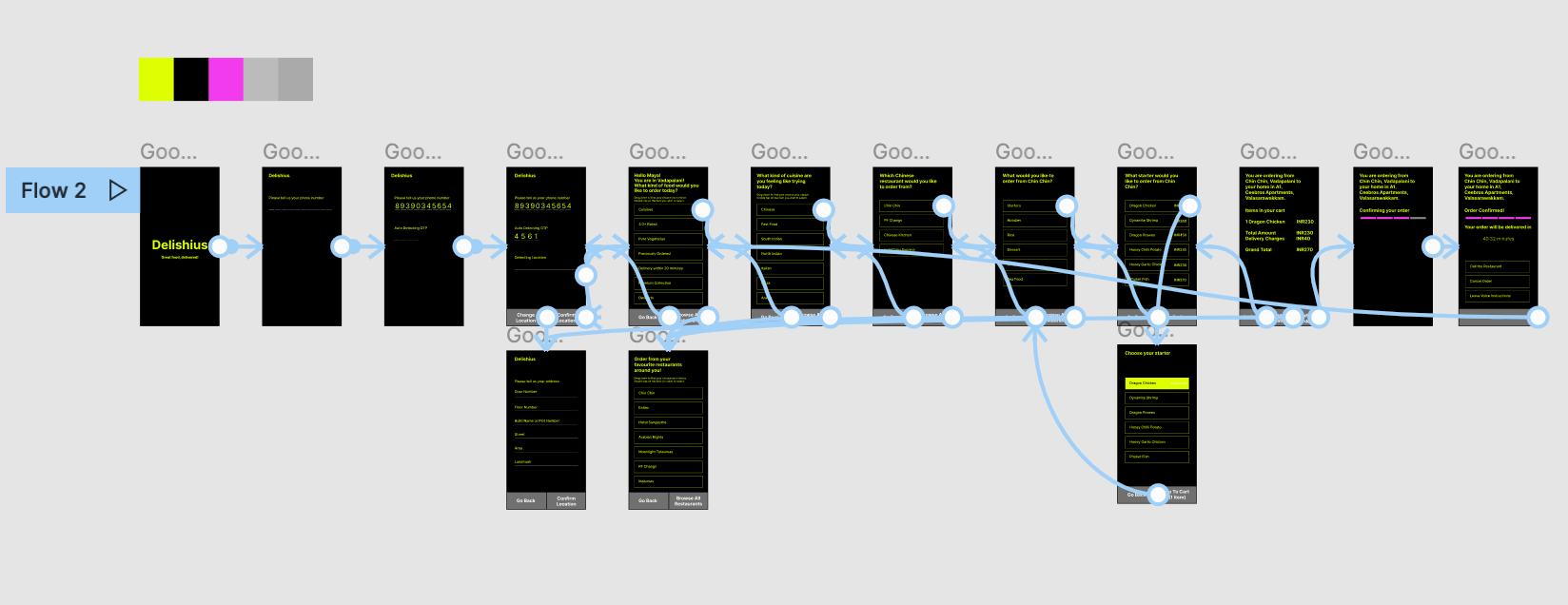
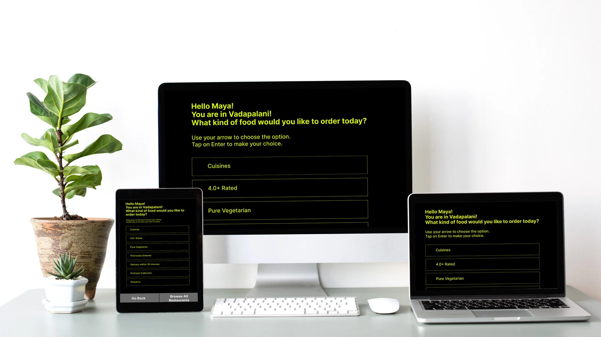
The app was also elaborated to be designed to be accessible on the web, and a tablet.
Accessibility Considerations adopted for the project:
High contrast screen after design
Fully Google TalkBack supported
Voice recording can be made after placing the order to leave instructions for the restaurant/delivery partner.
Passes all heuristics as much as possible.
Learnings & Next Steps
Designing with the heart- designing for social good and for people who are blind was a wholesome experience. Accessibility is a vital step in designing any digital product. More apps should consider accessibility seriously.
I learned that there is no need to create an app from scratch. An existing app can be redesigned to better suit customers who are visually challenged. This way, expenses and time taken to design can be reduced, thereby helping more people.