

Redesigning a Vaccination Center
While I was waiting for my COVID19 test in the month of September 2020, long before vaccinations were far from reality. I was an angry little person sitting and complaining about the waiting times, lack of social distancing measures, lack of safety precautions, non-availability of signage to guide me from one location to another, and so many more things. During my 45-minute wait time, I was planning out a center that could be developed, once vaccinations for this deadly disease have been made real. Here are a few things I jotted down in my notebook
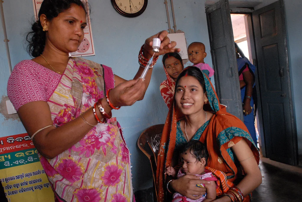
The Challenge & Objectives
I spoke to a few people who were at the center, trying to understand how they were able to navigate through the appointment booking and being at the location.
This contextual inquiry approach helped me understand how people moved through the location along with a bit of observation, find out how the movement of the people happened and how they entered with their vaccination slot booking.
To design a system that helps people get their vaccination appointment and vaccination shot easily.
Reduce complications associated with making payments, lack of directions or understanding of the next steps.
A system that will also help the next billion users.
The existing app to book appointments called CoWin was not really efficient and I wanted to re-design the same.
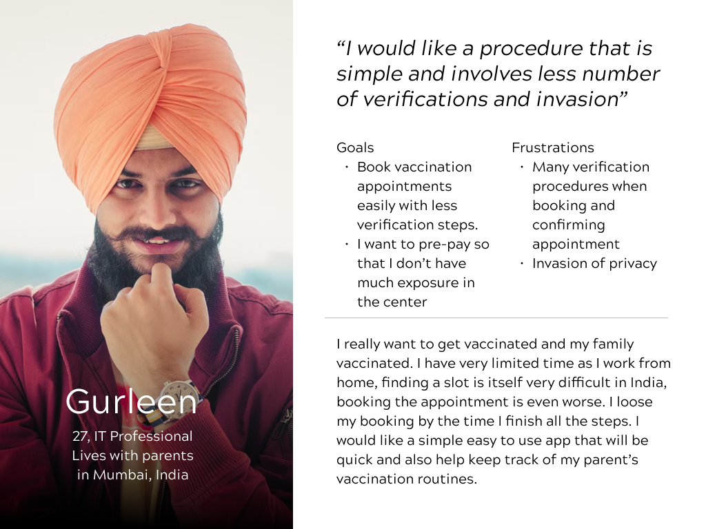
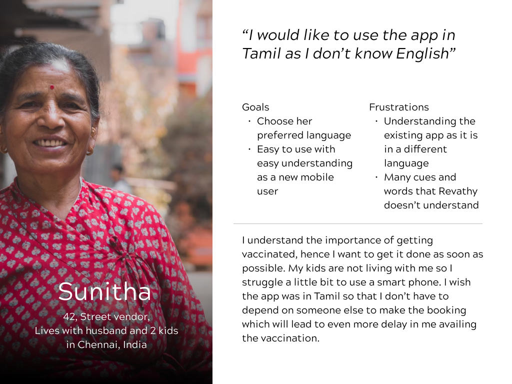
User Personas
Pain Points
Multiple verification steps when making booking on CoWin app.
Pay before we go to the vaccination center was not available.
App was available only in English which was not helpful for. Nor was it accessible.
Crazy eights attempt towards redoing the first onboarding step in the redesigned vaccination booking app.
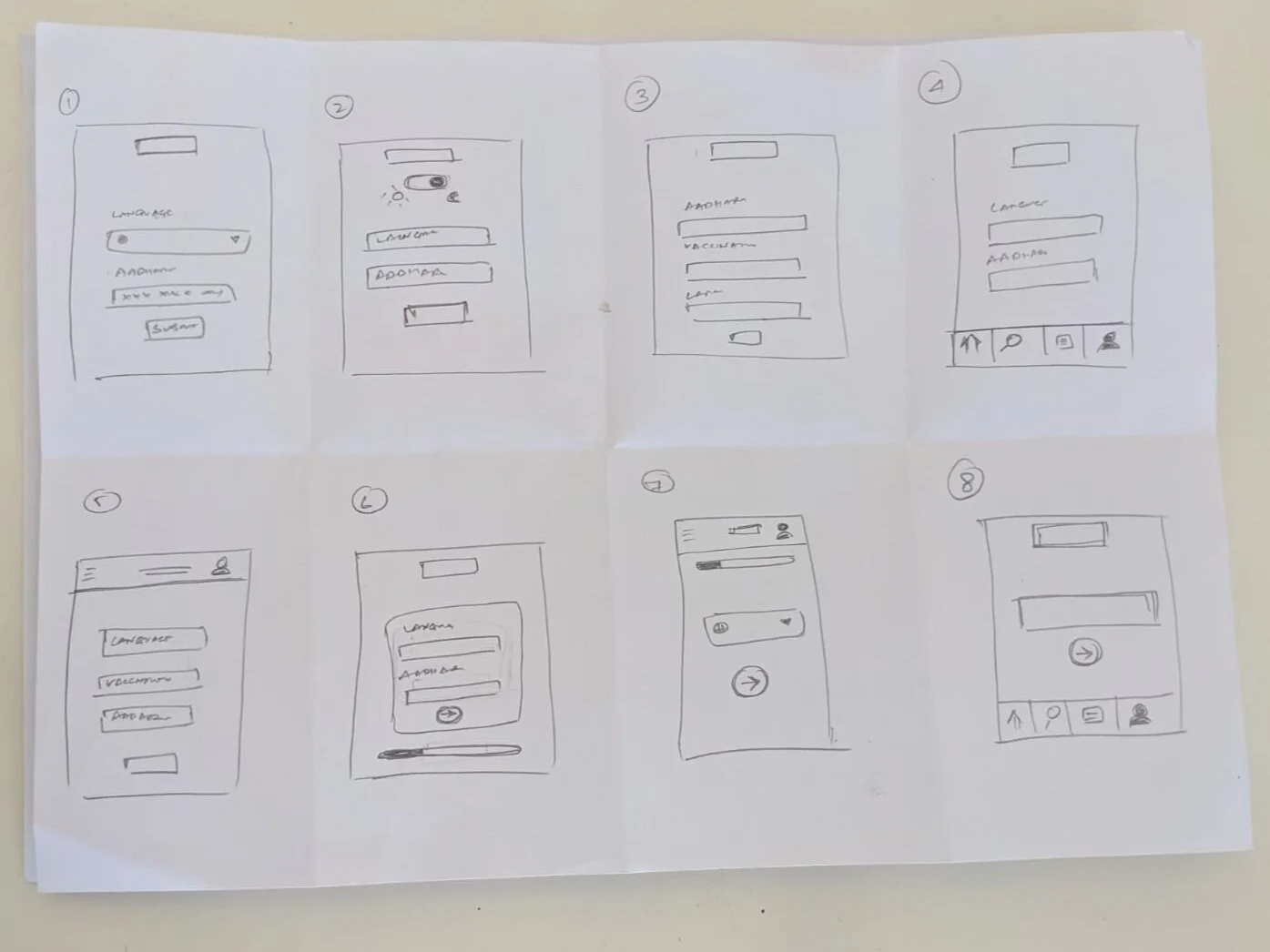

Lofi Prototype before conducting Usability Testing
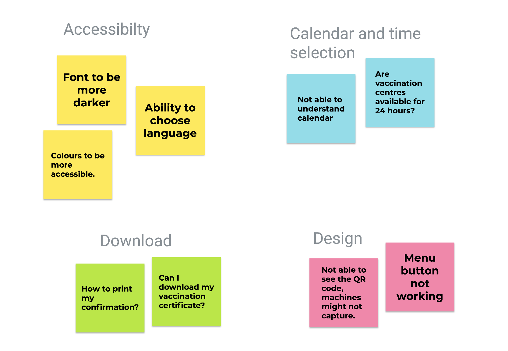
Video interviews were conducted with the four users and the affinity mapping to understand the themes of the issues in using the app was discovered.
They were grouped under Accessibility, Time selection, download option, and design.
Language was a main concern and the app was not permitting people to select a language in the beginning itself. Some connectivity was not done in the flow, which hindered the user from proceeding to the next step.
Since screenshot is mostly familiar with advanced users of phones, downloading of the vaccination certificate needed to be added.
QR code was small in the certificate generated. This had to be fixed int he hifi prototype.
Affinity Mapping
How was this app designed to cater to the next billion users?
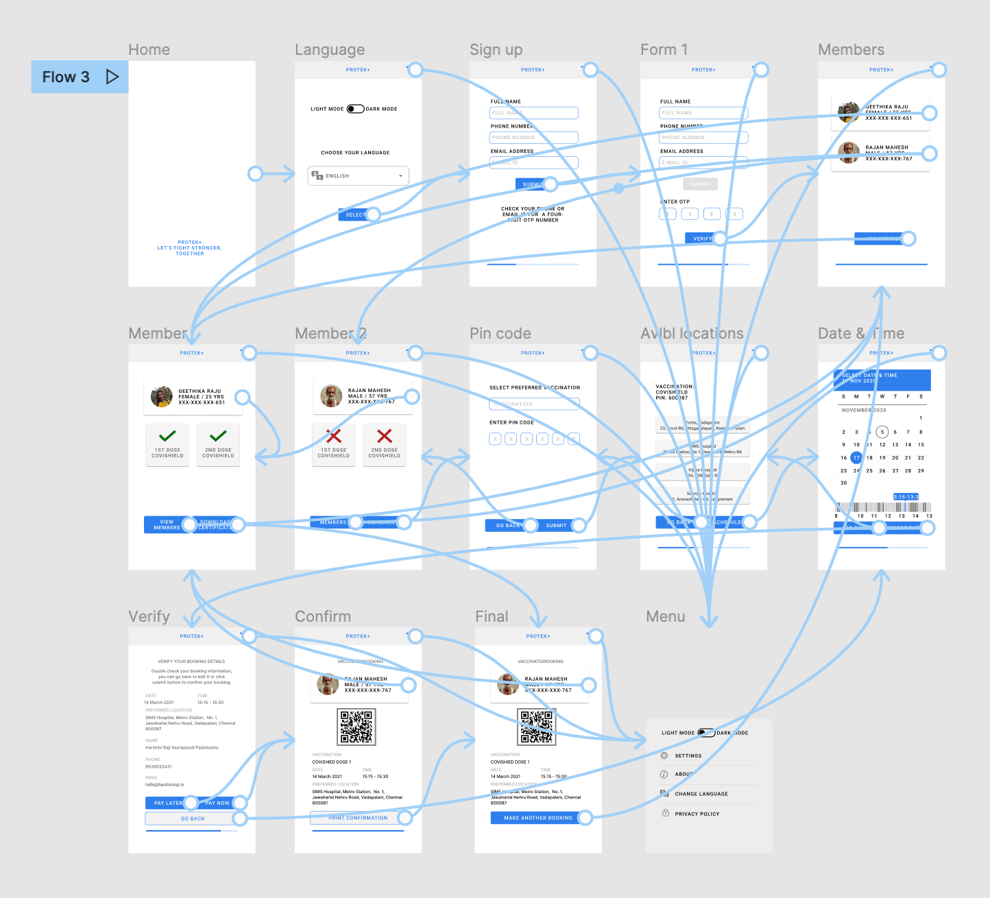
The app allowed a change of language in the first step of the onboarding process.
The app clearly indicated the next steps and considering heuristics, the app showed the system status and provided user control at every step so as to make it easier for anyone using the app for the first time. Recognition and recall was also major consideration in design.
The simple and easy-to-understand language was used through the app.
The design of images, icons, and everything were kept very close to the real world, for example, the integration of the calendar was kept to look like an everyday calendar we see in an Indian household.
Accessibility considerations
High Contrast Colours and Typography
The first prototype developed did not meet any accessibility requirements. However, with iterations, the second round included a better colour palette with a higher contrast, grey text was avoided for easier readability.
Language Selection
The freedom for a user to choose their preferred Indian Language helps even Next Billion Users to be able to easily make a vaccination appointment.
Light and Dark Modes
Light and dark modes will help users with limited visibility, especially catering to both situational as well as permanent visibility disabilities.
Service Design
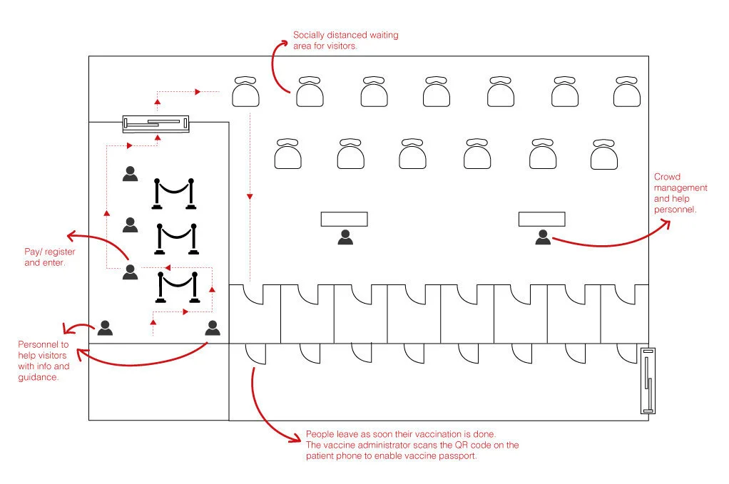
I also went a step ahead and incorporated how the app will help when the user reaches the vaccination spot. I had developed a floor map using my home’s hall area.
On the day of the Appointment:
The user receives a push notification 24 hours before the appointment date and again, 2-3 hours before the appointment time.
User will enter the location, and check with two of the personnel who will be available to assist at the entrance.
Three to four counters where users can go show the QR code on their app and make their payment and proceed to the waiting area.
Waiting area will be amply socially distanced, and vaccination cubicles will be available at the other end of the waiting hall.
We will have clear signage across the center and enough personnel to guide people if they are in doubt.
The vaccination administrator will call the user and once the vaccination has been administered, the clinician will scan the QR code, and immediately the app will display the page for the user to choose their second appointment dates and time.
Takeaways
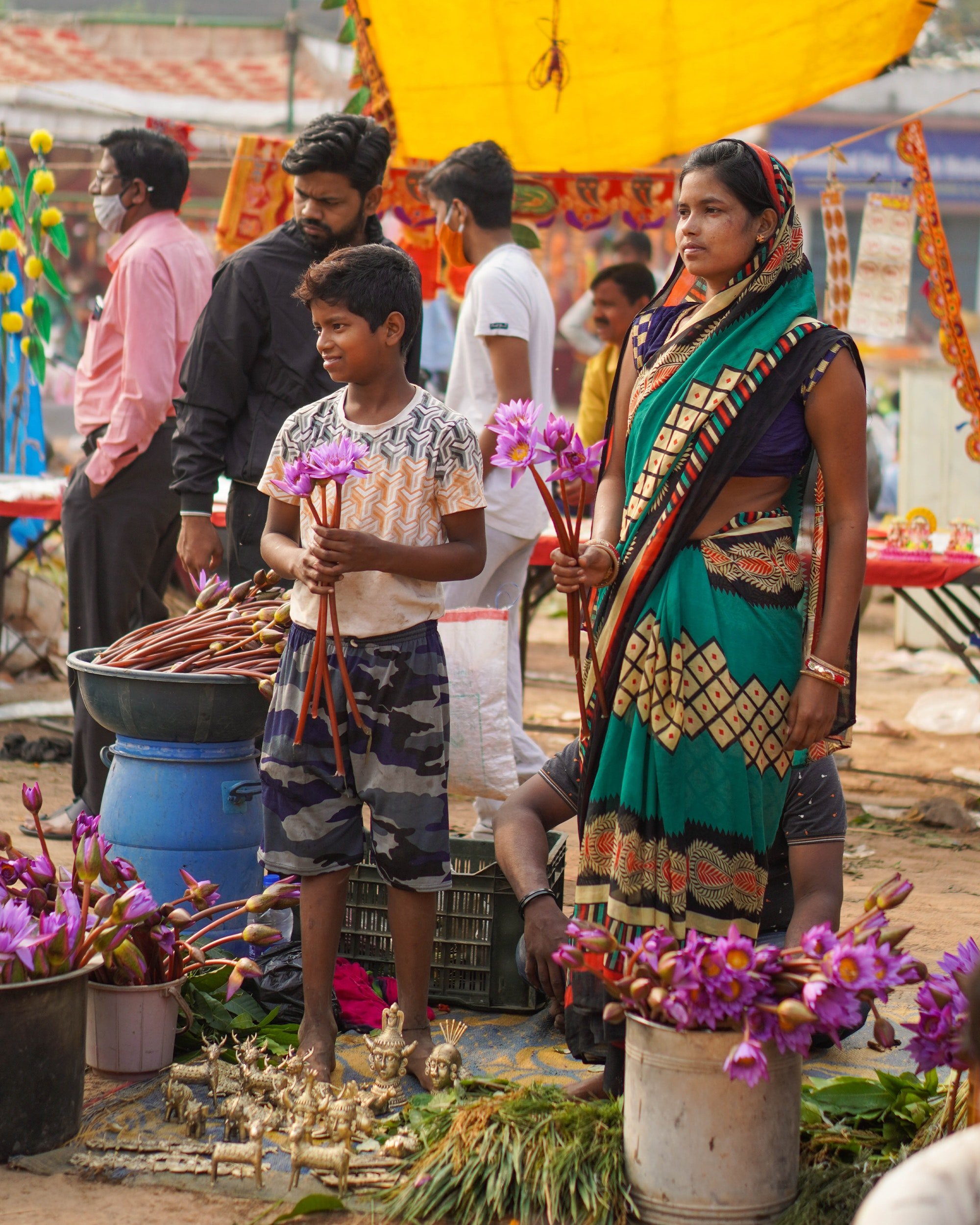
The primary focus in this exercise was for me to develop skills to design for Next Billion Users. Users who are new to the smartphone or internet. It is an important step in delivering vaccination, especially during a pandemic to a country like India, where people of many languages and capabilities are present.
When we are designing a common app, especially for a large country like India, it is important to consider multiple accessibility settings. This will help design for a wider audience, who need the vaccination and is also user friendly for them, when the stress caused by the pandemic is itself alarming.