
Case study
The Bambusa oil range was a farm-to-table packaging project focused on purity, sourcing, and natural credibility.
The challenge was to design packaging that felt clean and trustworthy without becoming generic. Oil packaging often leans into either overly traditional visual cues or overly premium minimalism. This range needed to feel natural, credible, and export-ready.
My role involved packaging design, label hierarchy, visual direction, and product storytelling across variants. The design needed to communicate sourcing, quality, and everyday usability while working clearly on shelf.
The approach was to keep the visual language calm, ingredient-led, and structured. The labels used a clear hierarchy so customers could quickly identify the product, understand the variant, and register the farm-to-table positioning.
The final system helped the range feel premium but grounded. It communicated natural sourcing and quality through restraint, clarity, and consistency rather than excessive claims.
Additional screens, artifacts, and process details.
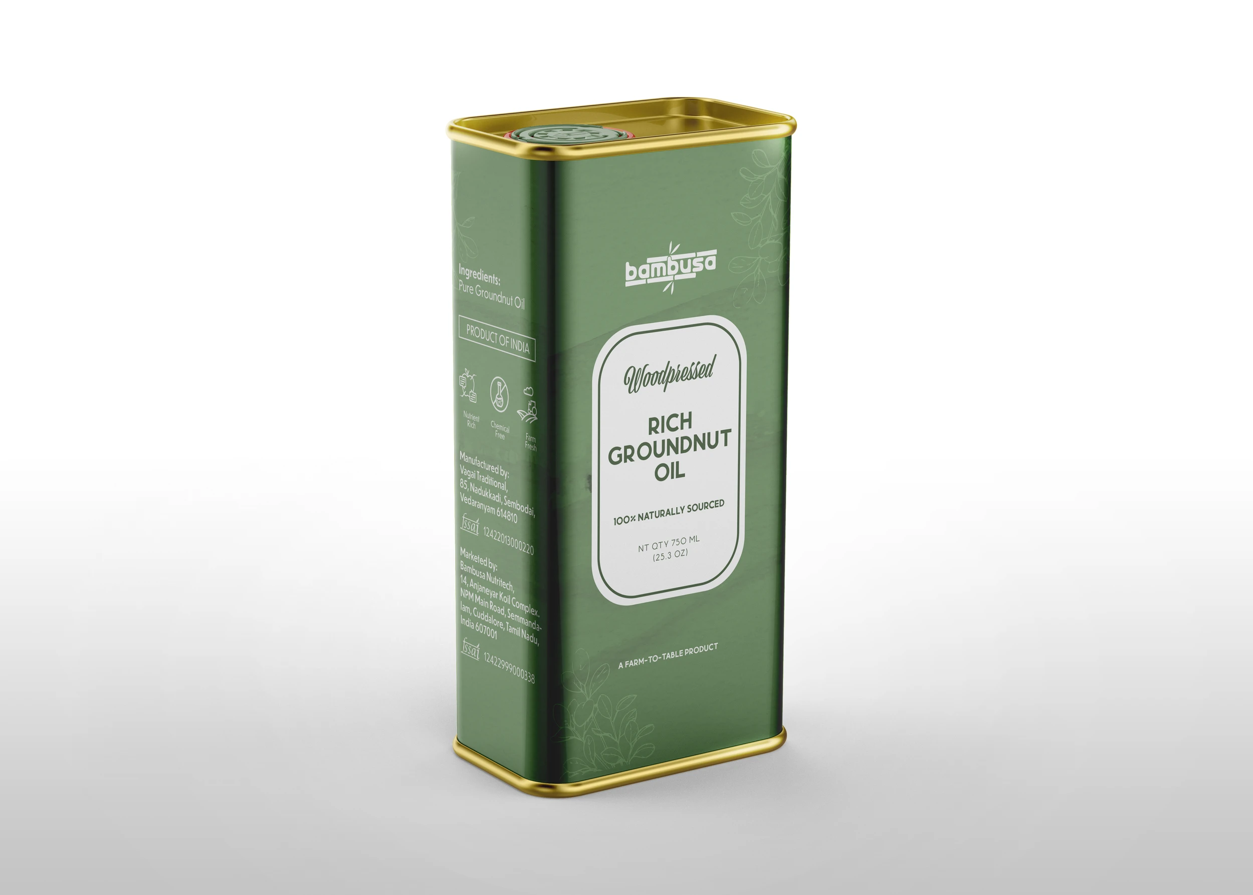
Case image 01
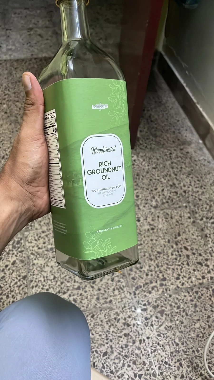
Case image 02
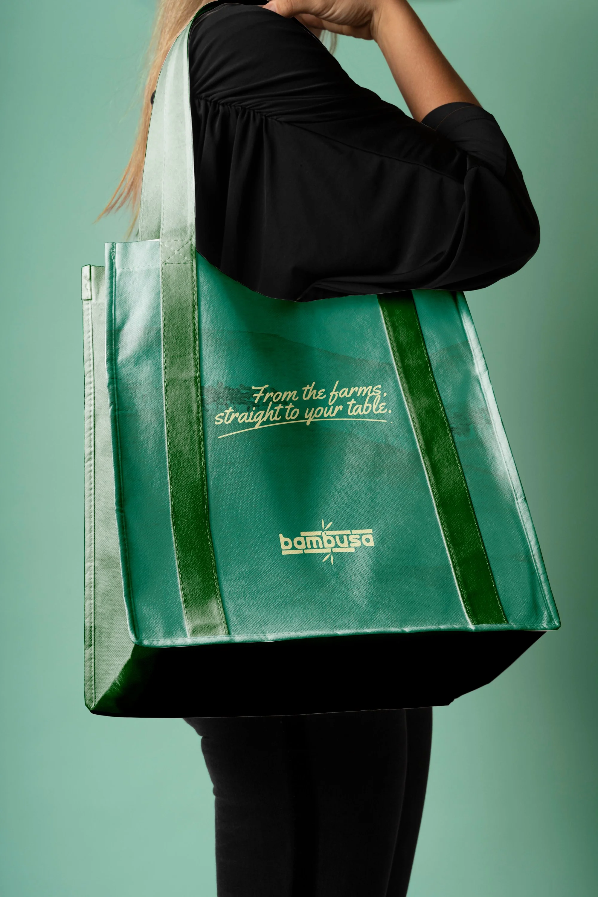
Case image 03
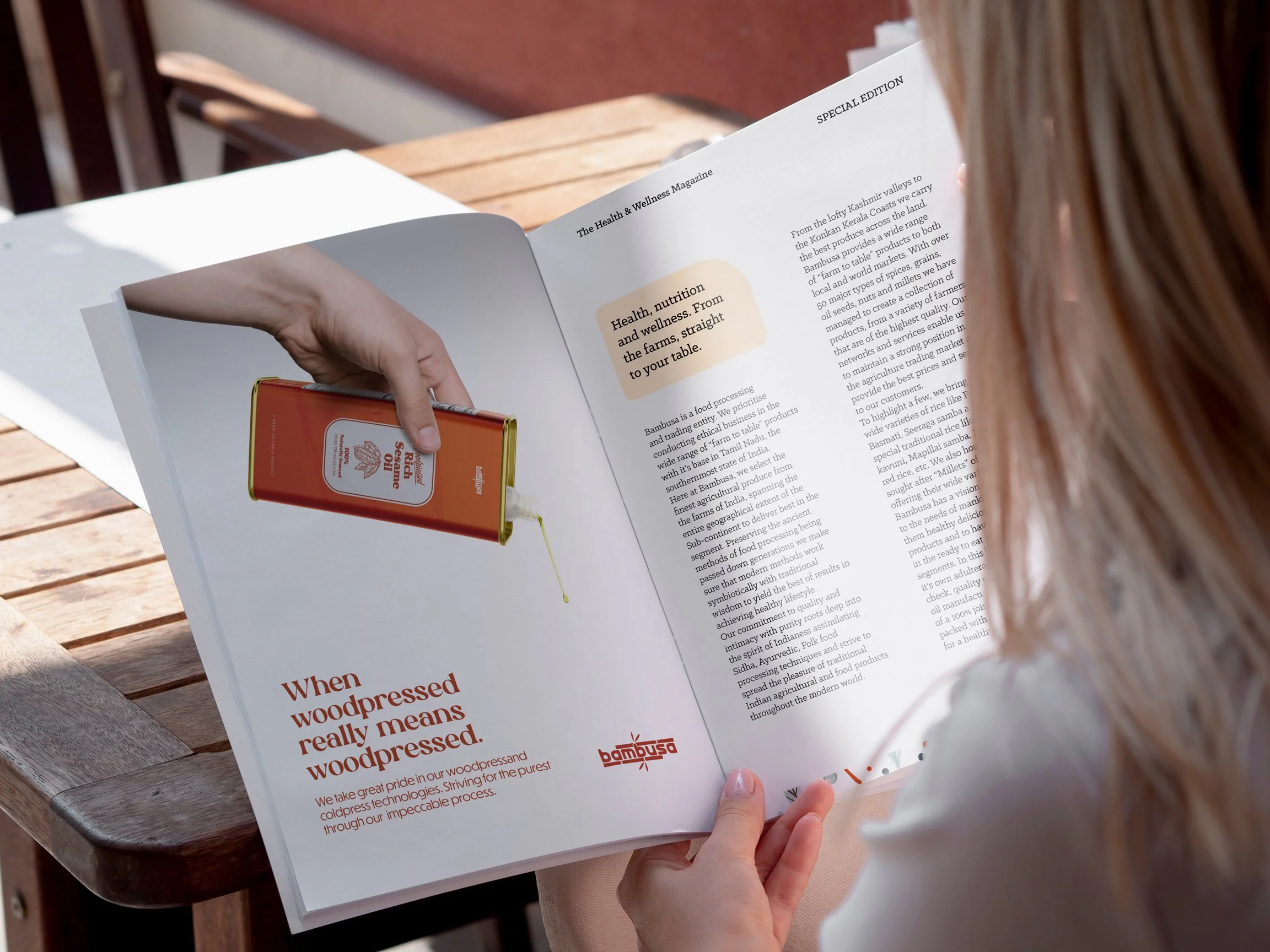
Case image 04
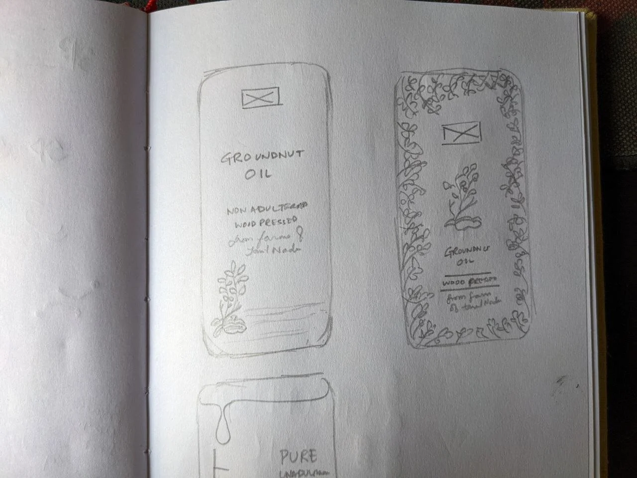
Case image 05

Case image 06