Case study
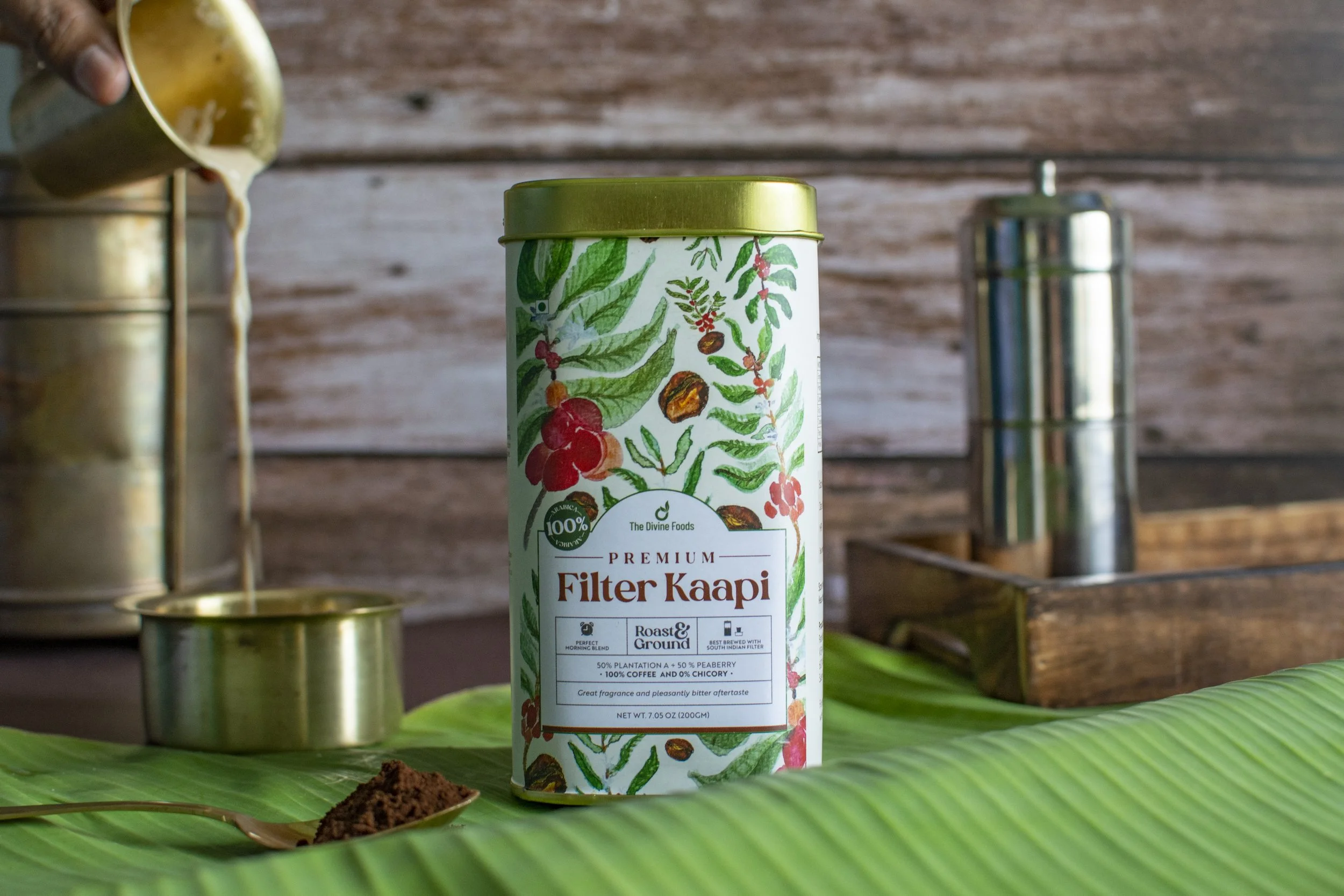
Divine Foods needed packaging and communication that could make traditional Tamil food products feel clear, trustworthy, and relevant for modern households.
The challenge was that many products were rooted in native ingredients and traditional food wisdom, but required explanation for today’s customer. The design had to carry health, culture, farmer stories, and everyday usability without becoming too text-heavy or nostalgic.
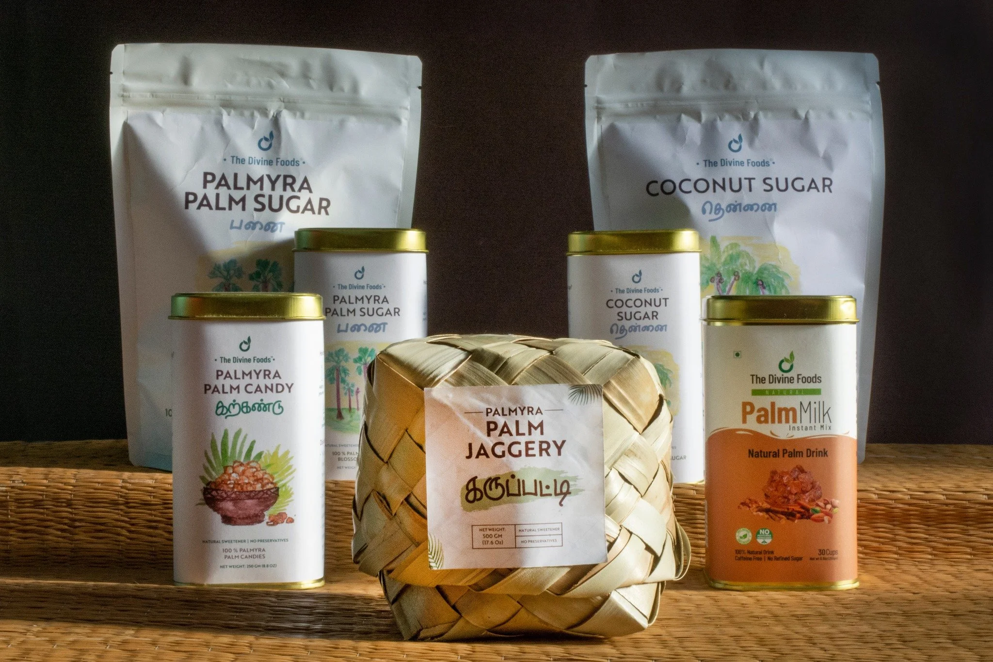
My role covered packaging design, visual communication, gifting concepts, product storytelling, and content hierarchy. I worked across product ranges such as health mixes, baby cereals, palm sugar, honey, soups, turmeric-based products, and festive gifting.
The approach was to build a flexible communication system around five pillars: tradition, health, farmers, fair trade, and happiness. Each pack or communication piece had to answer quickly: what is this, why does it matter, how do I use it, and why should I trust it?
The final design direction balanced cultural warmth with D2C clarity. It helped Divine Foods communicate a wide product range through packaging that felt rooted, useful, and emotionally meaningful.
Additional screens, artifacts, and process details.
Case image 01

Case image 02

Case image 03

Case image 04

Case image 05

Case image 06