Farm to Table:
Packaging Design for Bambusa Oil Range
TL;DR
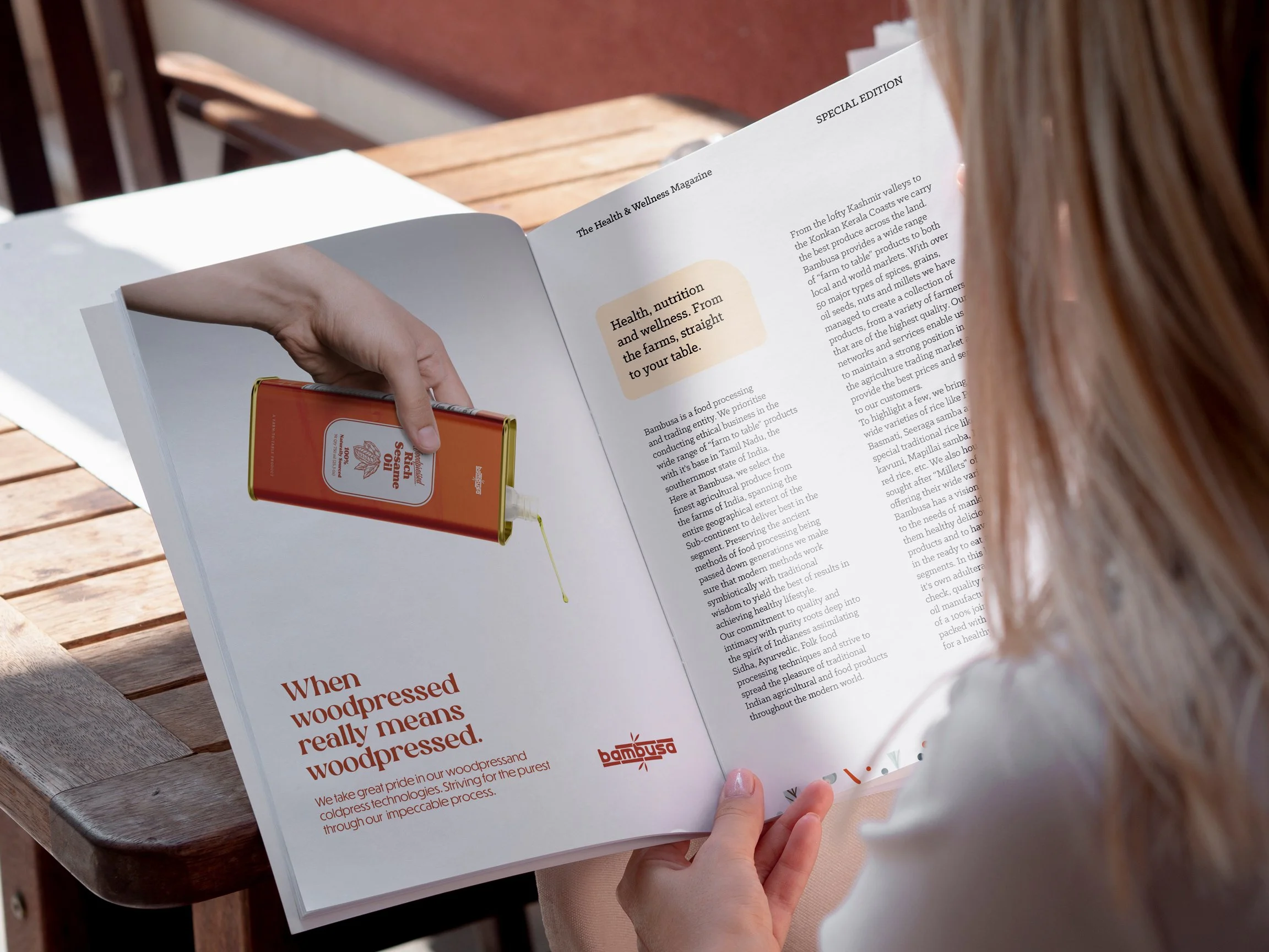
Bambusa Nutritech is a brand that is passionate about reviving traditional methods of extracting and processing cooking oils, along with procuring the finest quality of rice, spices, foodstuff, and more.
They plan on venturing into the Malaysia, Singaporean, and Middle Eastern markets, starting with their range of cooking oils.
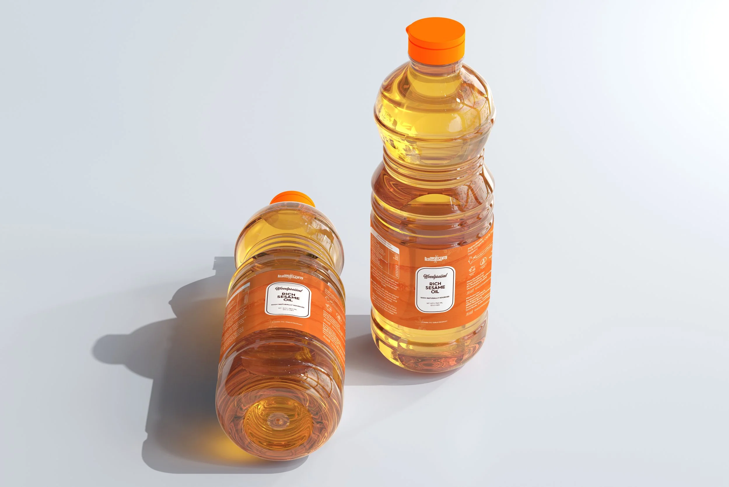
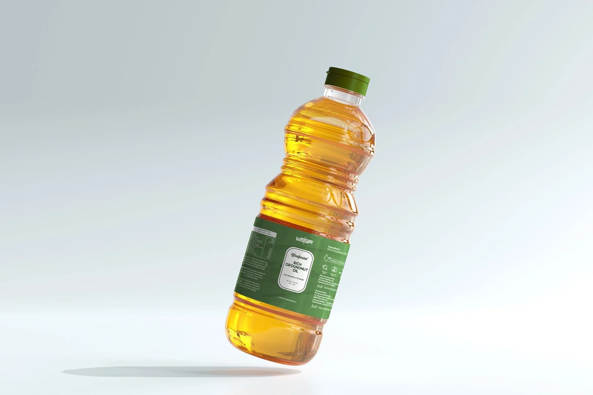
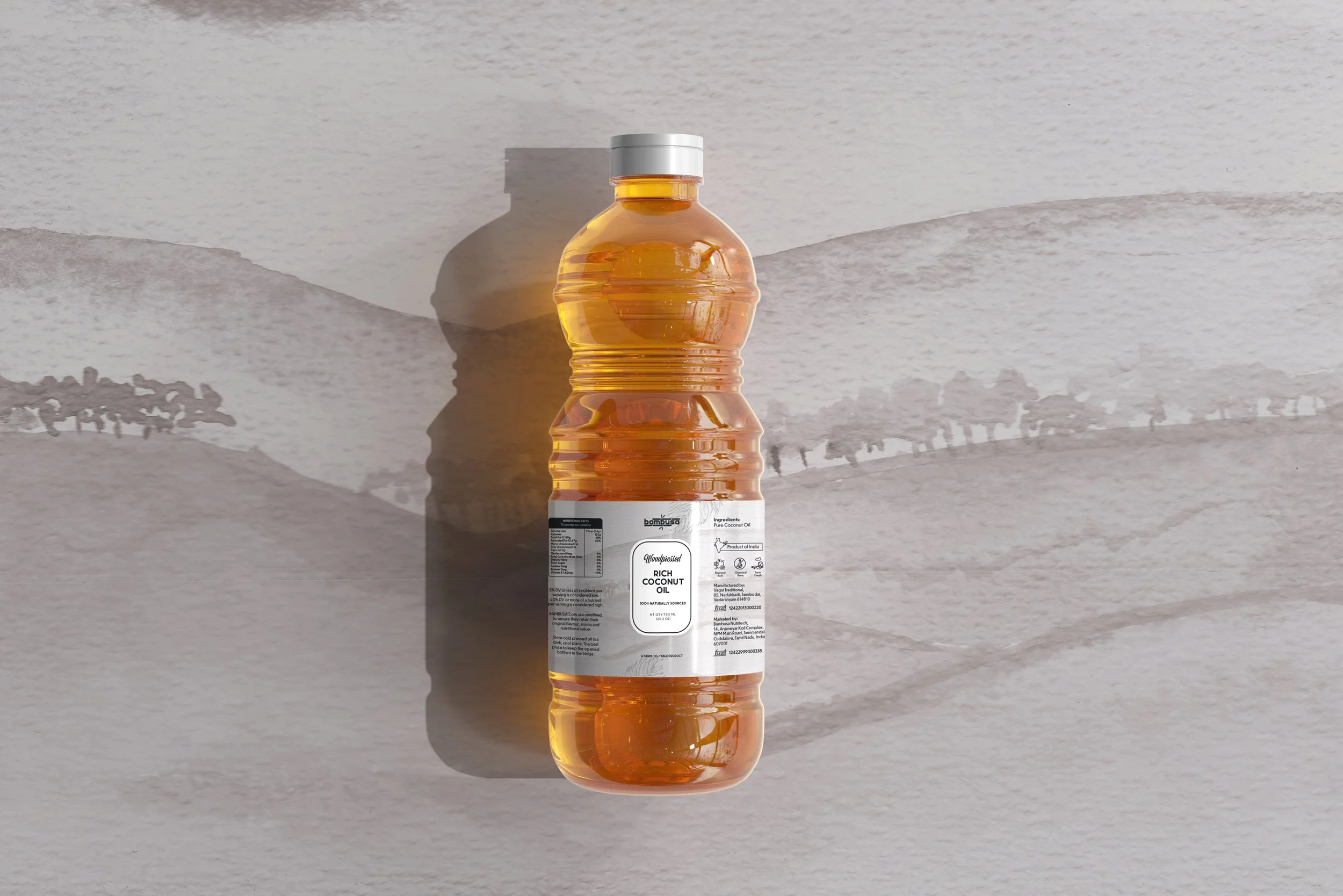
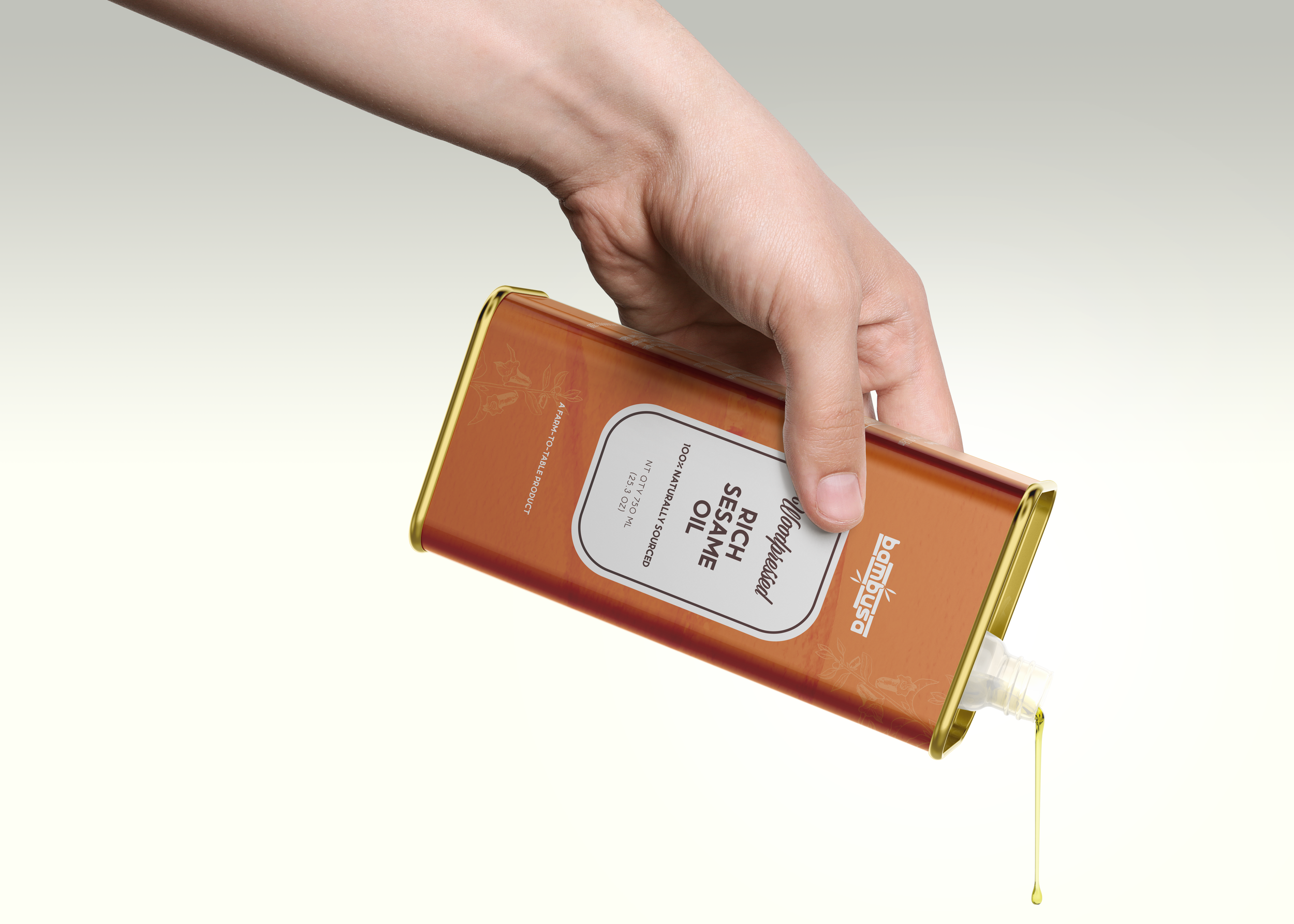
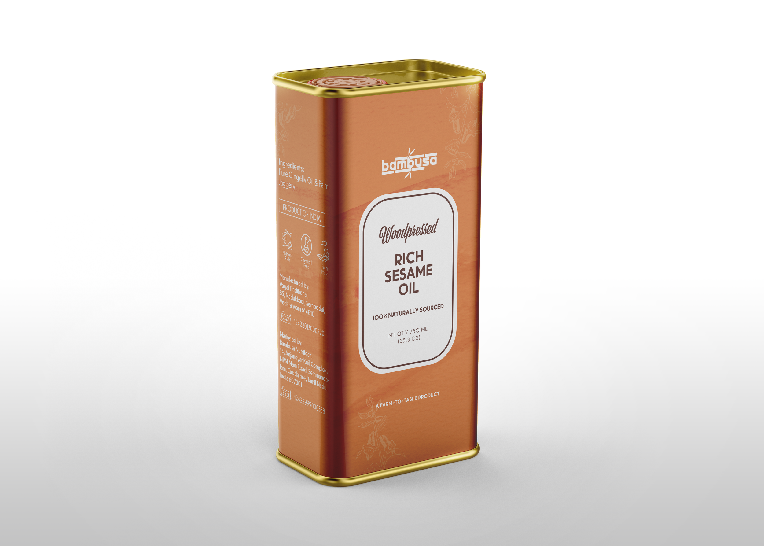
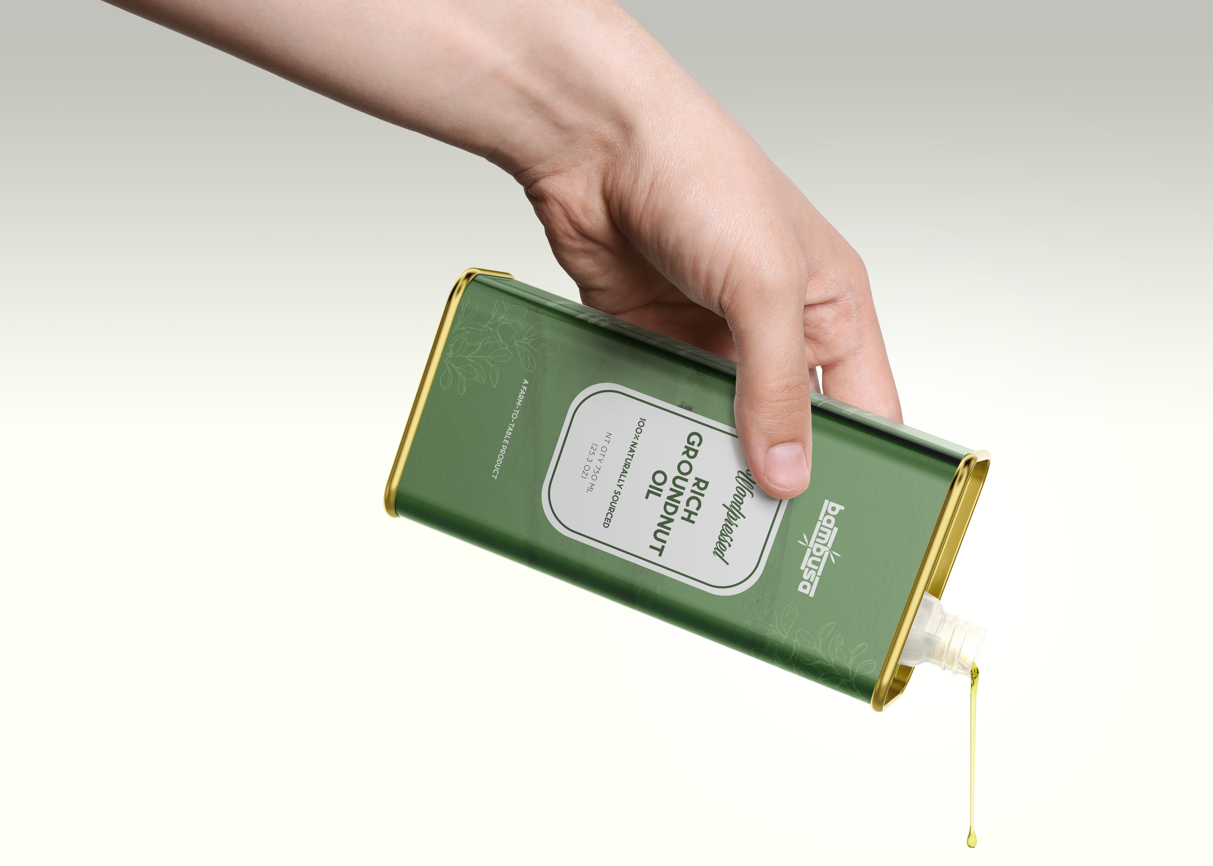
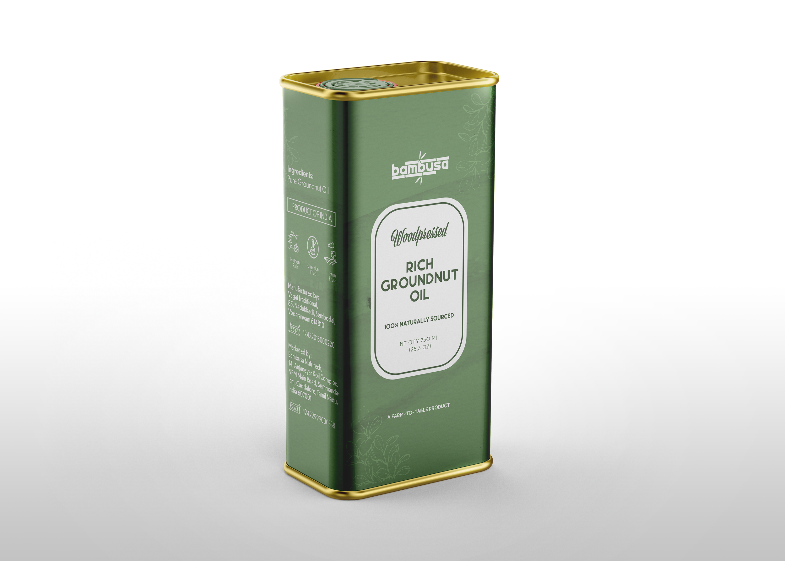
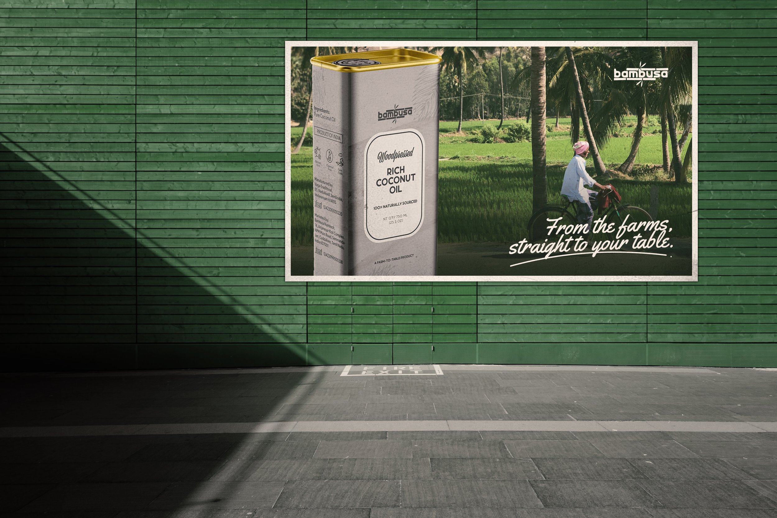
I worked on the packaging design for the first three products- Groundnut, Sesame, and Coconut oil packaging and adapted the same for glass bottles, pet bottles, and tin packaging.
The design was catered toward a premium audience located in the above-mentioned areas.
The brand was planning to expand their product offering so the design was made to be more scalable in the future.
International Demography
A packaging design that will convert across different demographics but will also sit well in the local market.

Establish Nativity
The brand takes great pride in hailing from Tamil Nadu and the packaging visually should embody the same.

Minimal & Premium
The packaging had to reflect both nativities, luxury, and premium-ness at the same time as the products were of a higher price point.
Objectives

Scalable master graphic
The current art direction will form the base for all upcoming products (rice, spices, etc). Hence the design must be scalable.
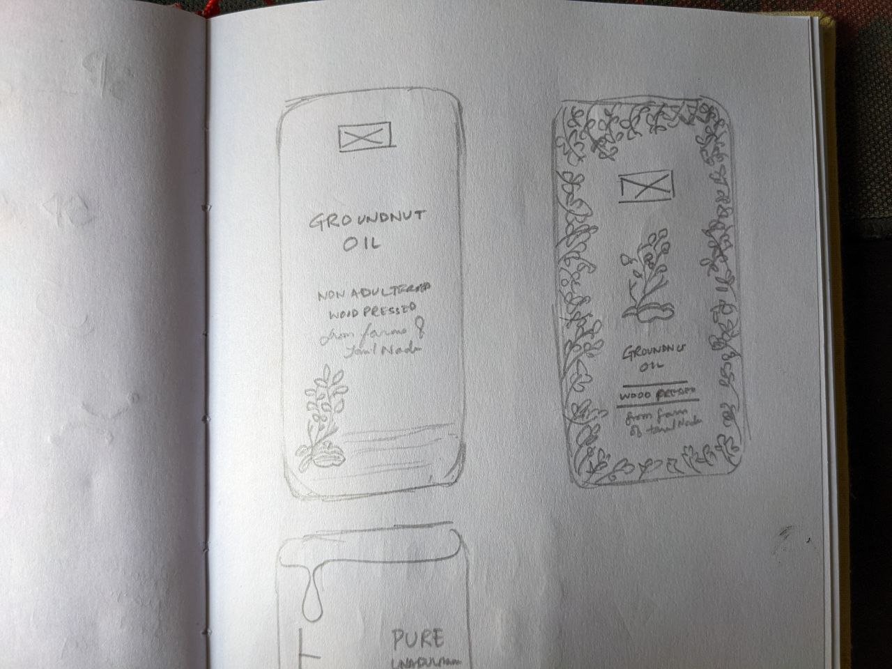
After multiple visits to the store and online research of competitors for the brand, a set of clear directions for the art direction of the packaging was derived.
Bambusa oil’s opportunity area lies in exploring a unique color palette, different from the competitors.
Bambusa oil’s opportunity area lies in exploring a unique color palette, different from the competitors.
Handpainted elements can provide a premium feeling and emphasize the quality as well as the hand-made feature.
People know when and how to use oils, they are recurring buyers, so there is no need to add the raw material photo or the end product photo/ illustration.
The Design Process
Competitor Analysis: Intense competitor analysis and multiple store visits in UAE and in India helped understand how the existing products were packaged and designed.
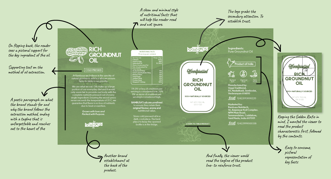
Infusing Nativity : As it was important to highlight elements of Tamil Nadu in the packaging, I worked on a background that showed a farm, among hills and trees, trying to replicate an image that was shot on one of my research trips.
Information Architecture: In a highly populated shelf of oil products, it is important to capture and hold the reader’s eyes. The information architecture and visual hierarchy was tested on multiple focus groups to pick out the right one.
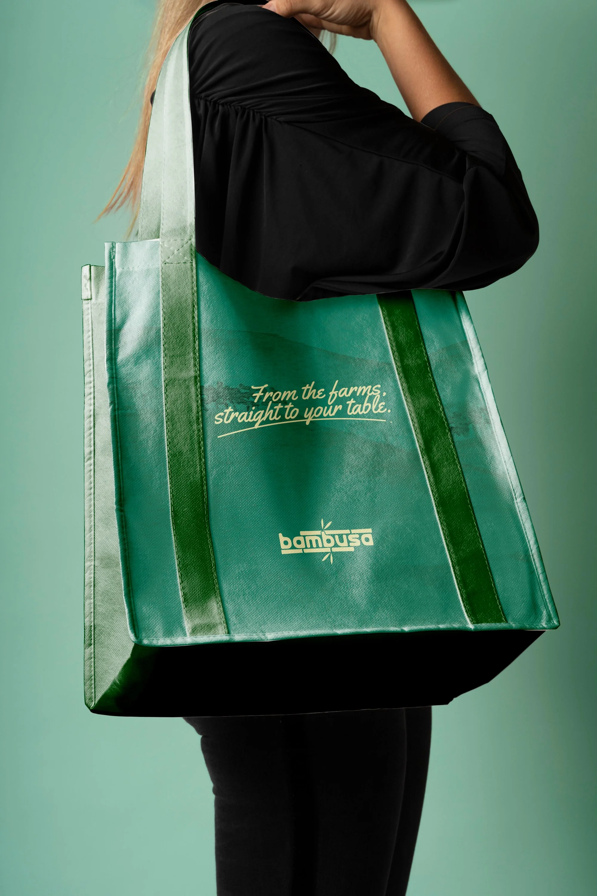
Unique Colour Palette: A color palette that is different from the competitors and also conveys that the product belongs to a premium price range was developed- Orange, Green and Grey.
Design Drafts Proposed
-
![]()
Design Draft #1
-
![]()
Design Draft #2
-
![]()
Design Draft #3
-
![]()
Design Draft #4
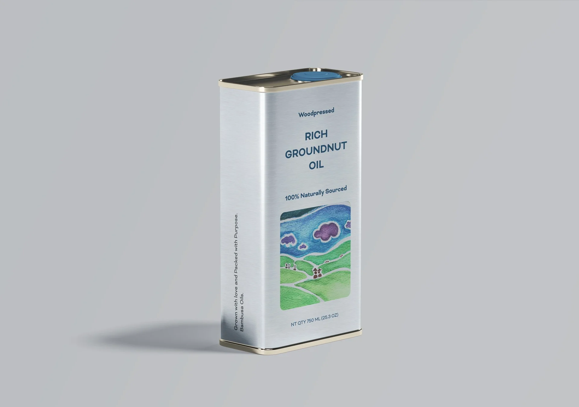
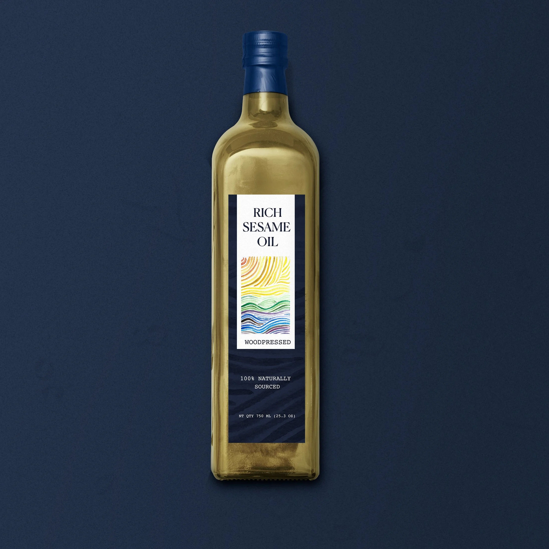
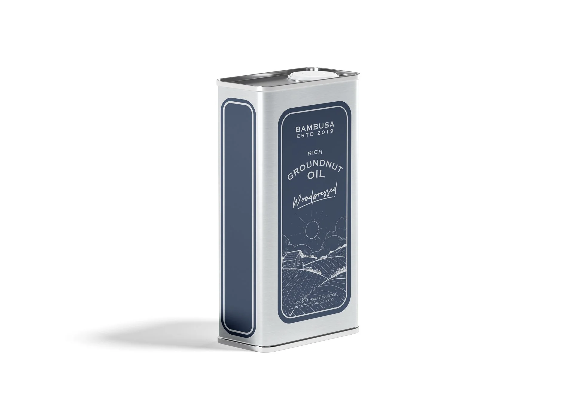
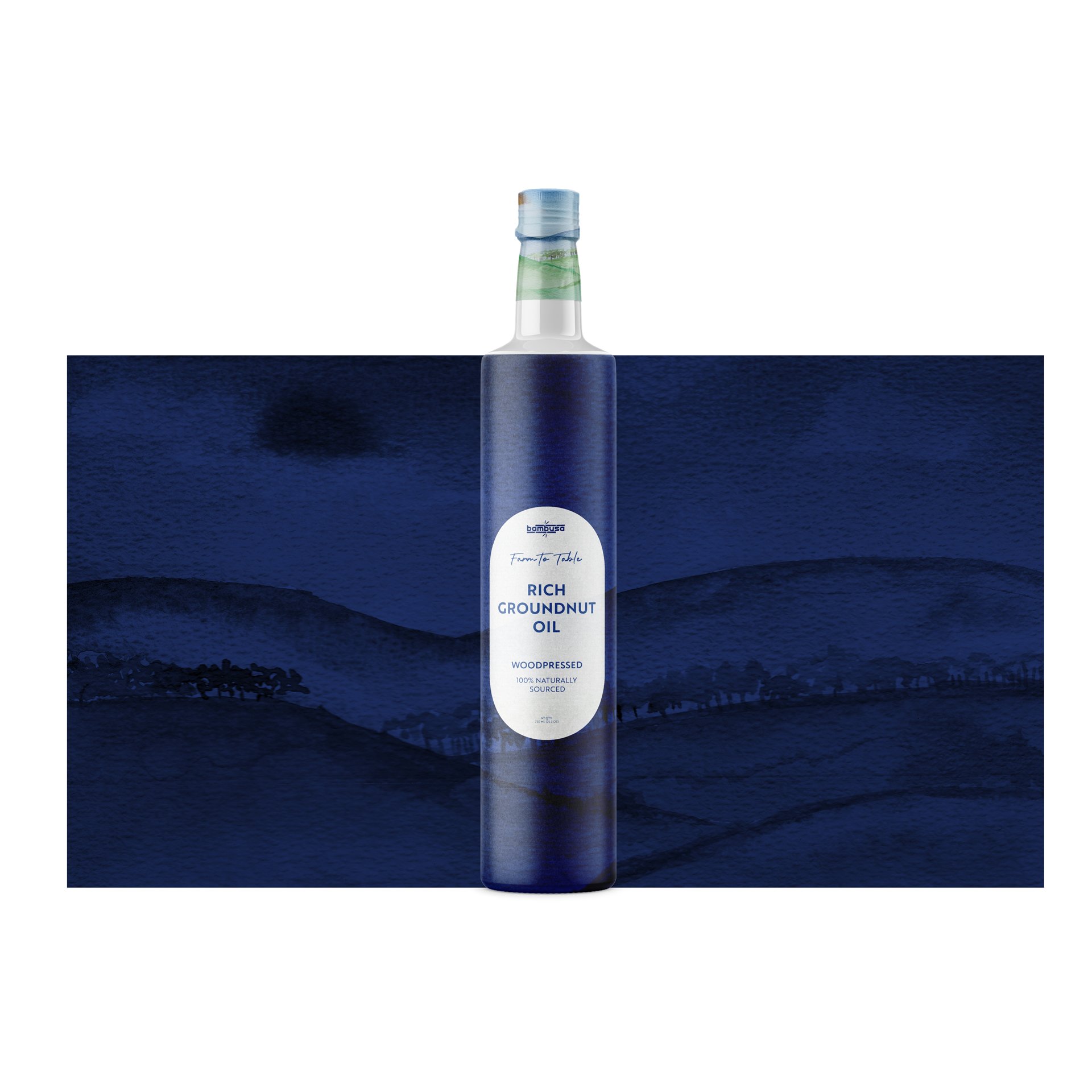

Design draft #4 was selected and multiple iterations were done and the output without an illustration in the center was picked and it is currently under production.