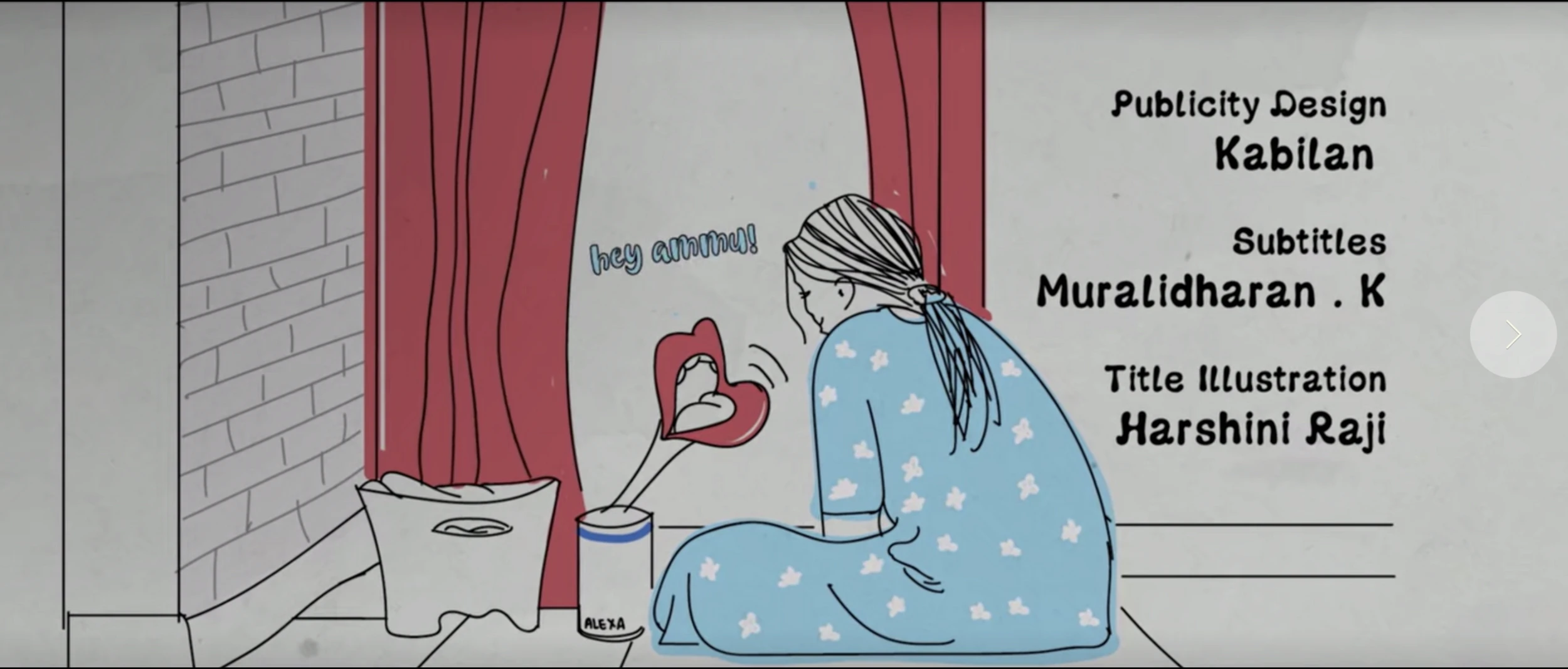
Case study
This project involved creating illustrated title treatments for feature films, where the typography and visual language had to carry the mood of the story.
The challenge was to make each title feel cinematic, distinctive, and rooted in the film’s emotional world. A title illustration cannot simply decorate the name; it has to hint at genre, tone, character, and memory before the viewer even enters the story.
My process involved understanding the narrative context, identifying the emotional quality of the film, and translating that into lettering, illustration, composition, and visual texture.
The design approach changed depending on the film. Some titles needed restraint and atmosphere; others needed stronger character, rhythm, or cultural cues.
This work sits at the intersection of illustration, typography, and storytelling. It helped me think about how visual identity can operate at a narrative level — not just as branding, but as an entry point into a world.
Additional screens, artifacts, and process details.
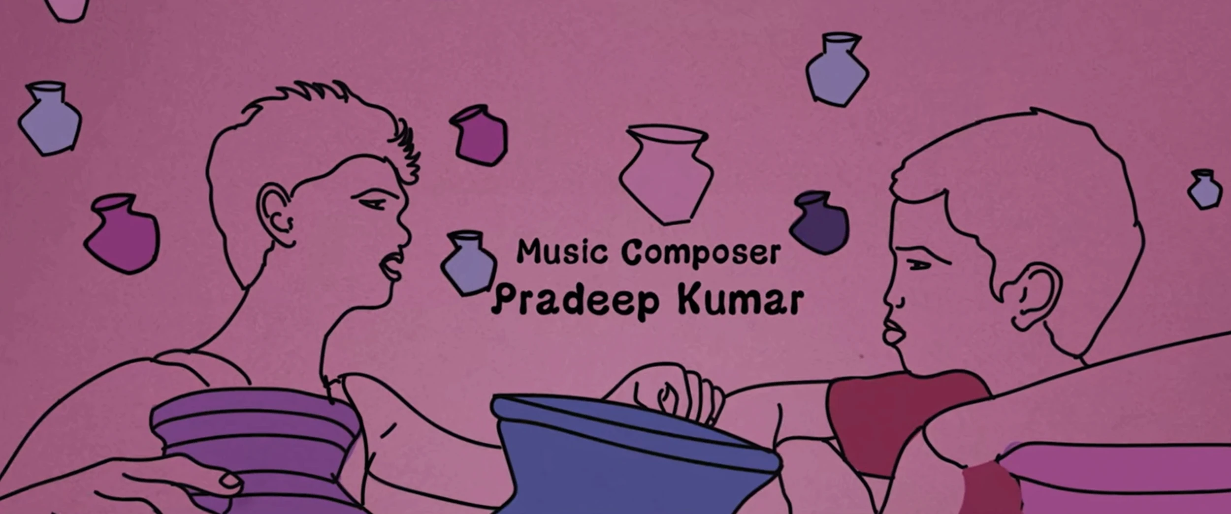
Case image 01
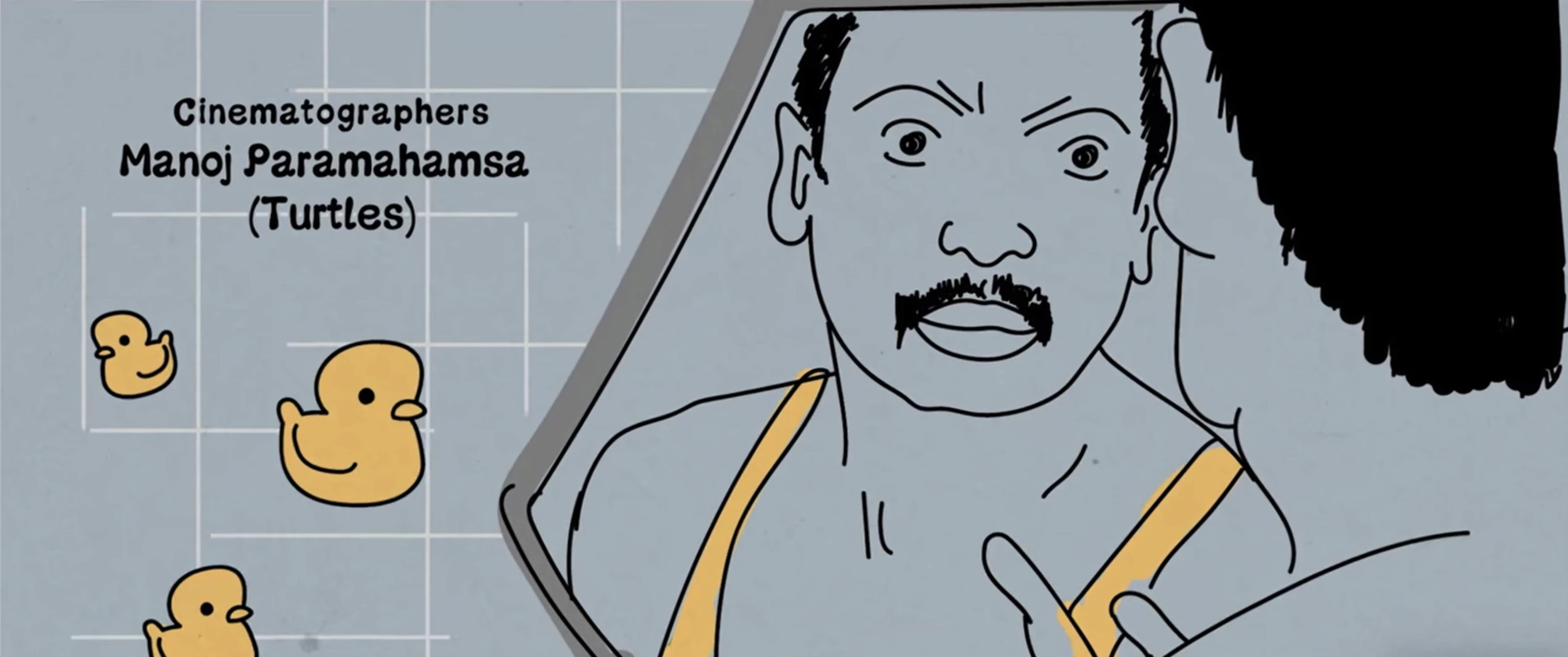
Case image 02
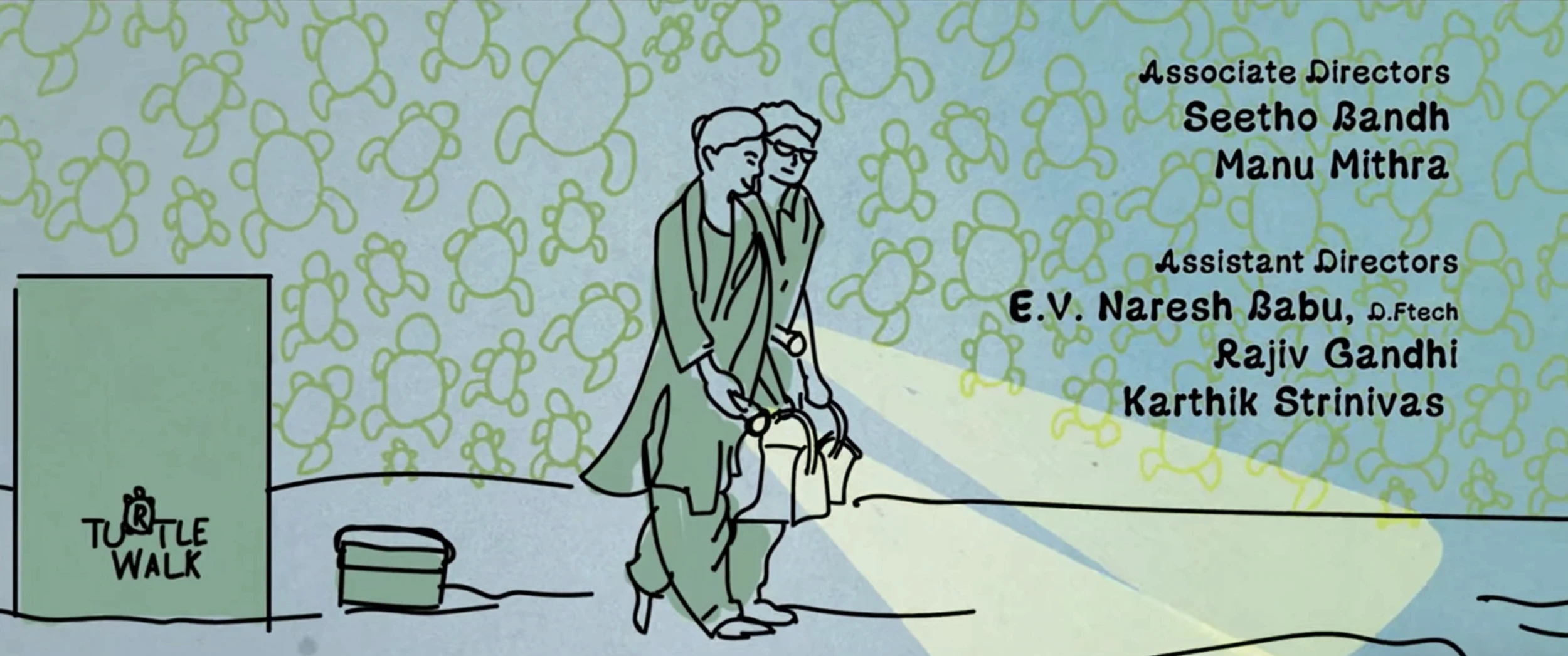
Case image 03

Case image 04
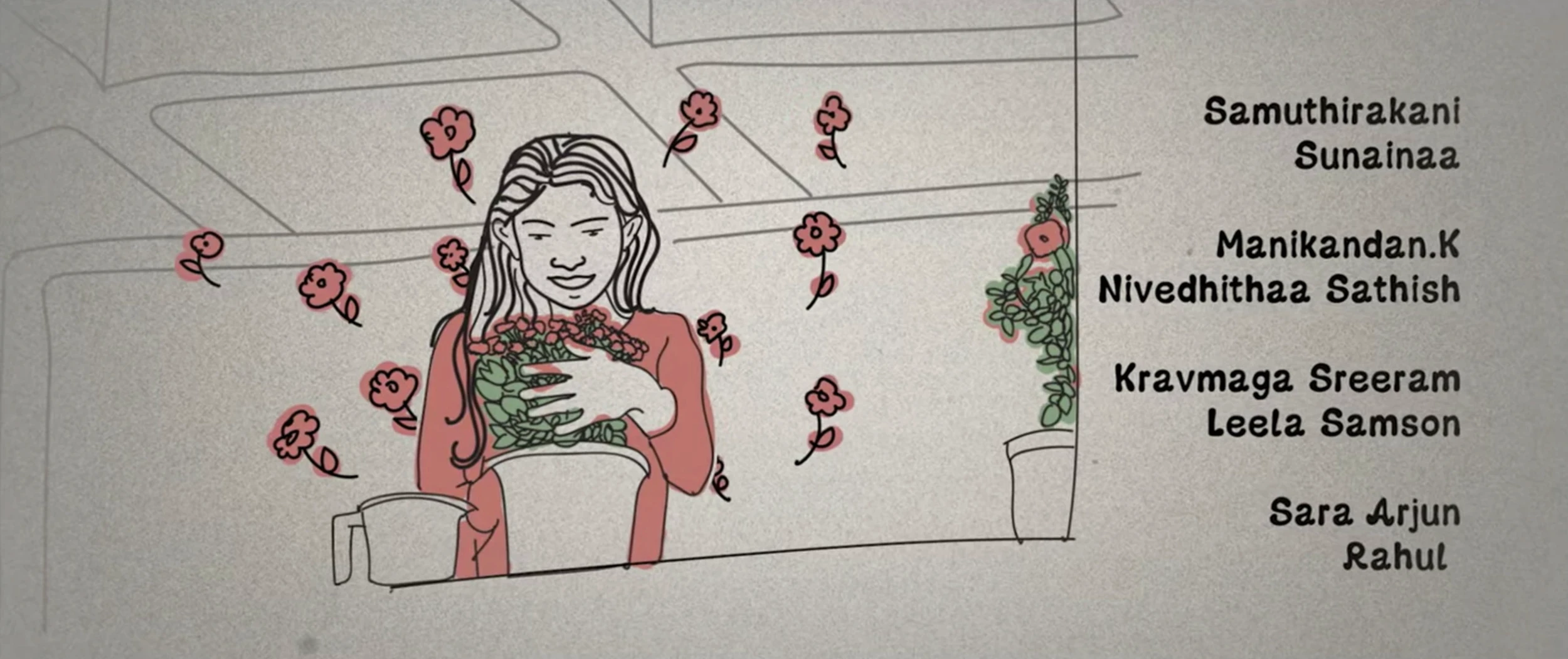
Case image 05
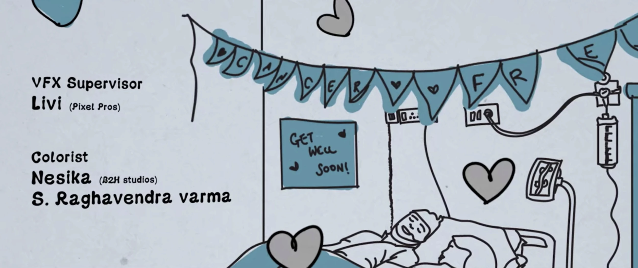
Case image 06