Case study

Joie The Dessert Bar

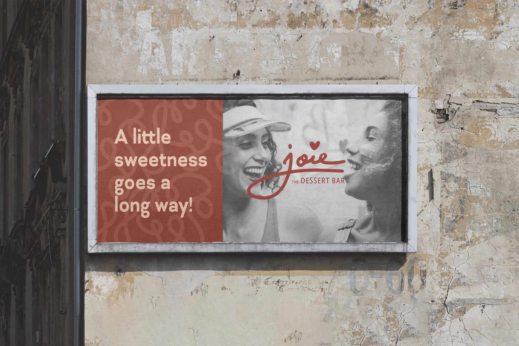
Naming and visual identity for a dessert brand designed to feel playful, indulgent, and contemporary.

Naming and visual identity for a dessert brand designed to feel playful, indulgent, and contemporary.

Role

Naming, brand identity, pattern design, visual language

Timeline

4 weeks

Role

Naming, brand identity, pattern design, visual language

Role

Naming, brand identity, pattern design, visual language

Methods

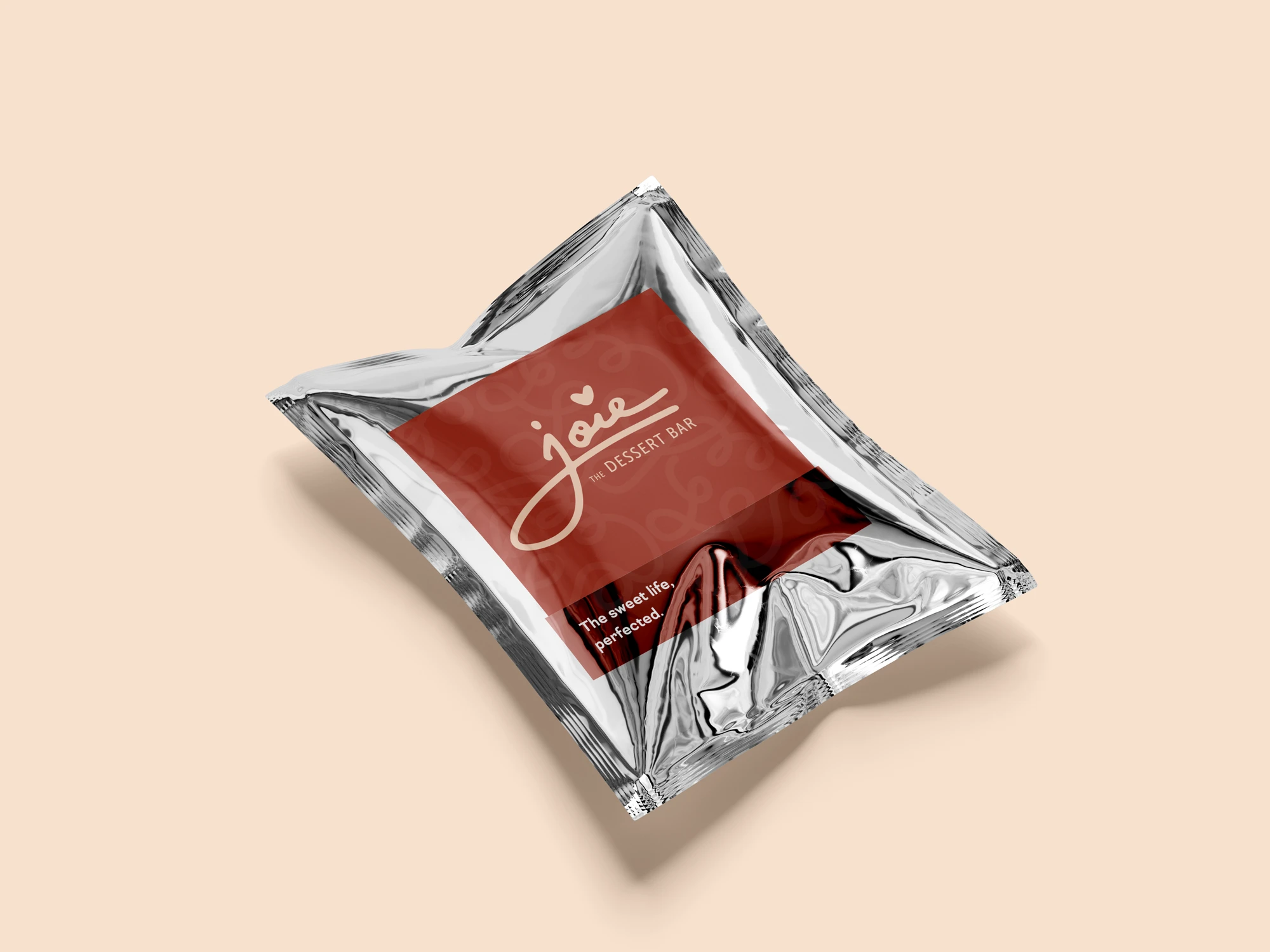
Naming exploration, moodboarding, logo direction, pattern system, packaging touchpoints

Methods

Naming exploration, moodboarding, logo direction, pattern system, packaging touchpoints

Design decisions

The identity needed to hold delight and polish at the same time. I leaned into expressive forms, soft details, pattern language, and a name that could feel joyful without becoming childish or overly decorative.

Design decisions

The identity needed to hold delight and polish at the same time. I leaned into expressive forms, soft details, pattern language, and a name that could feel joyful without becoming childish or overly decorative.

Solution + impact

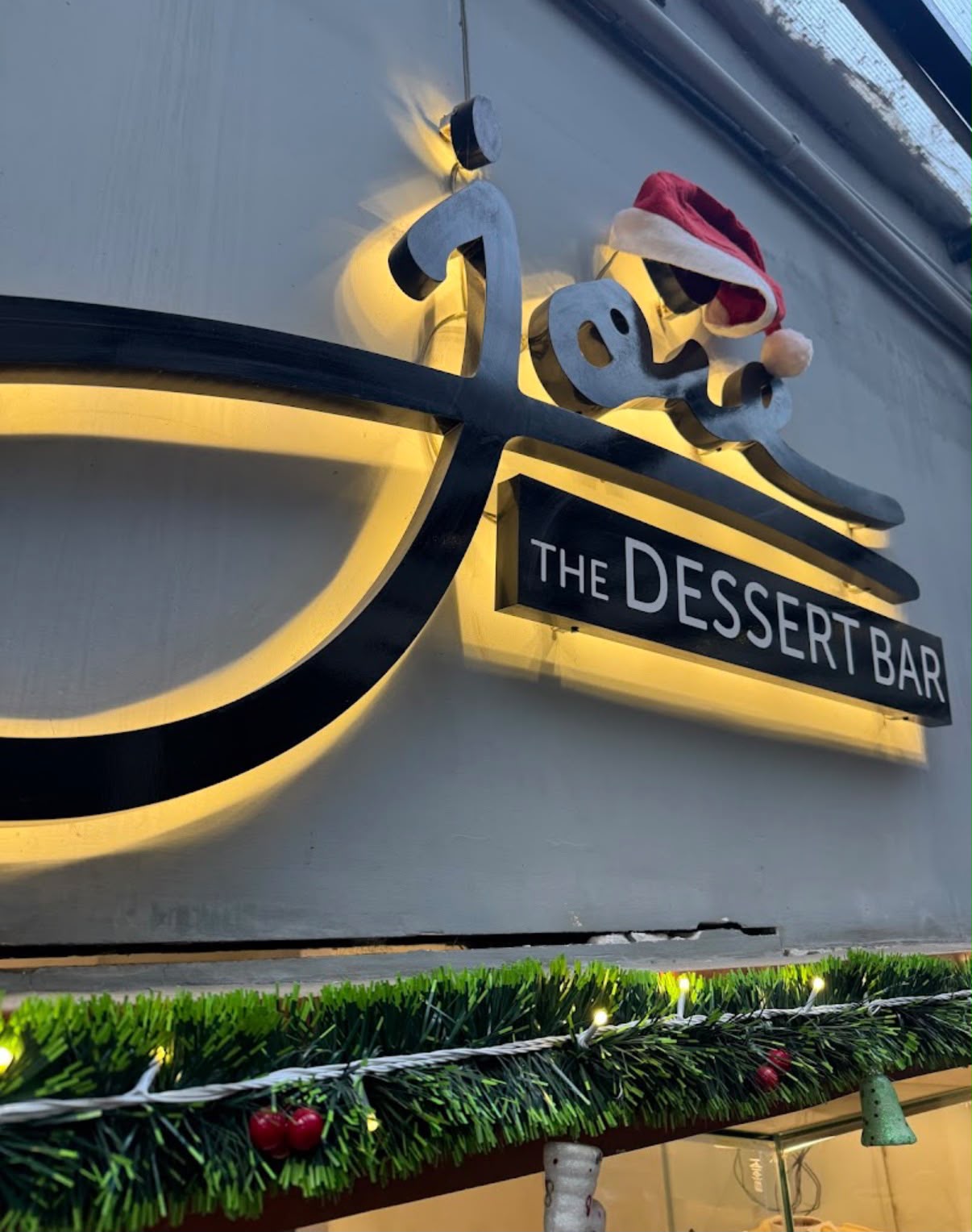
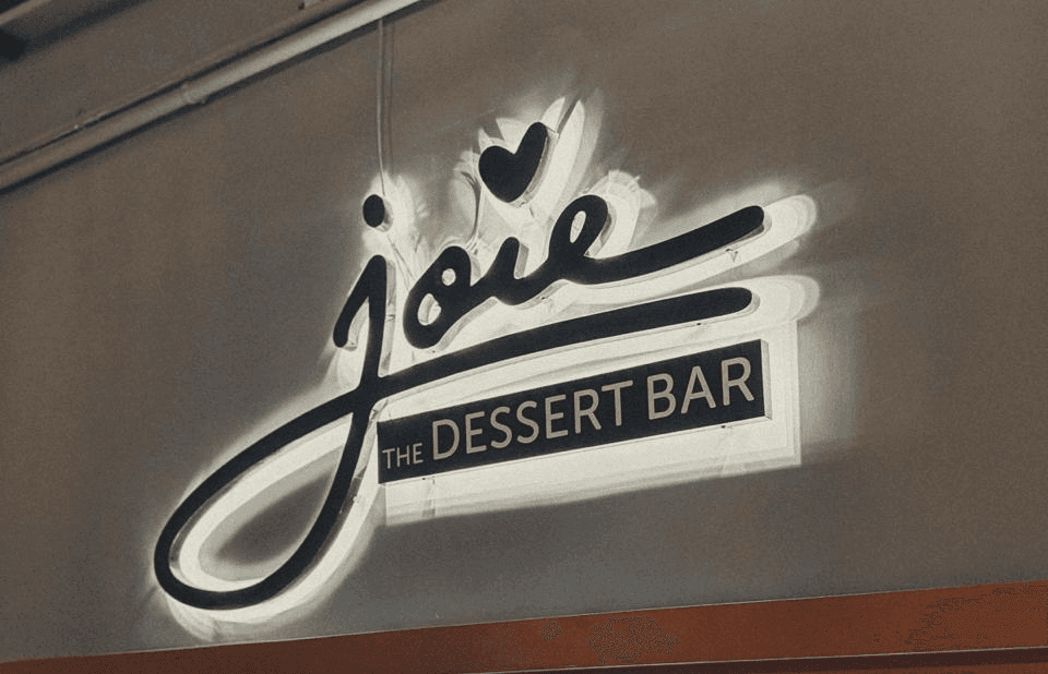
The final identity gave Joie a distinctive dessert-brand world that could extend across boxes, labels, social media, and in-store communication. It made the brand feel playful, contemporary, and memorable across packaging touchpoints.

Solution + impact

The final identity gave Joie a distinctive dessert-brand world that could extend across boxes, labels, social media, and in-store communication. It made the brand feel playful, contemporary, and memorable across packaging touchpoints.

Case study

Joie was a naming and identity project for a dessert brand that needed to feel indulgent, playful, and memorable without becoming childish.

The challenge was to create a brand world that could hold both delight and polish. Dessert brands often lean either too premium and distant, or too decorative and generic. Joie needed a visual identity that felt joyful, contemporary, and flexible across packaging and customer touchpoints.

I worked on the naming, visual direction, identity system, pattern language, and packaging extensions. The design used expressive forms, soft visual details, and a playful graphic system to create a brand that felt warm and distinctive.

The final identity gave the brand a clearer personality and a visual language that could scale across boxes, labels, social media, and in-store communication.

The project reinforced how naming and visual identity work together. A good dessert brand does not only need to look appetizing; it needs to create a feeling people remember.

Additional screens, artifacts, and process details.
Case image 01
Case image 02
Case image 03
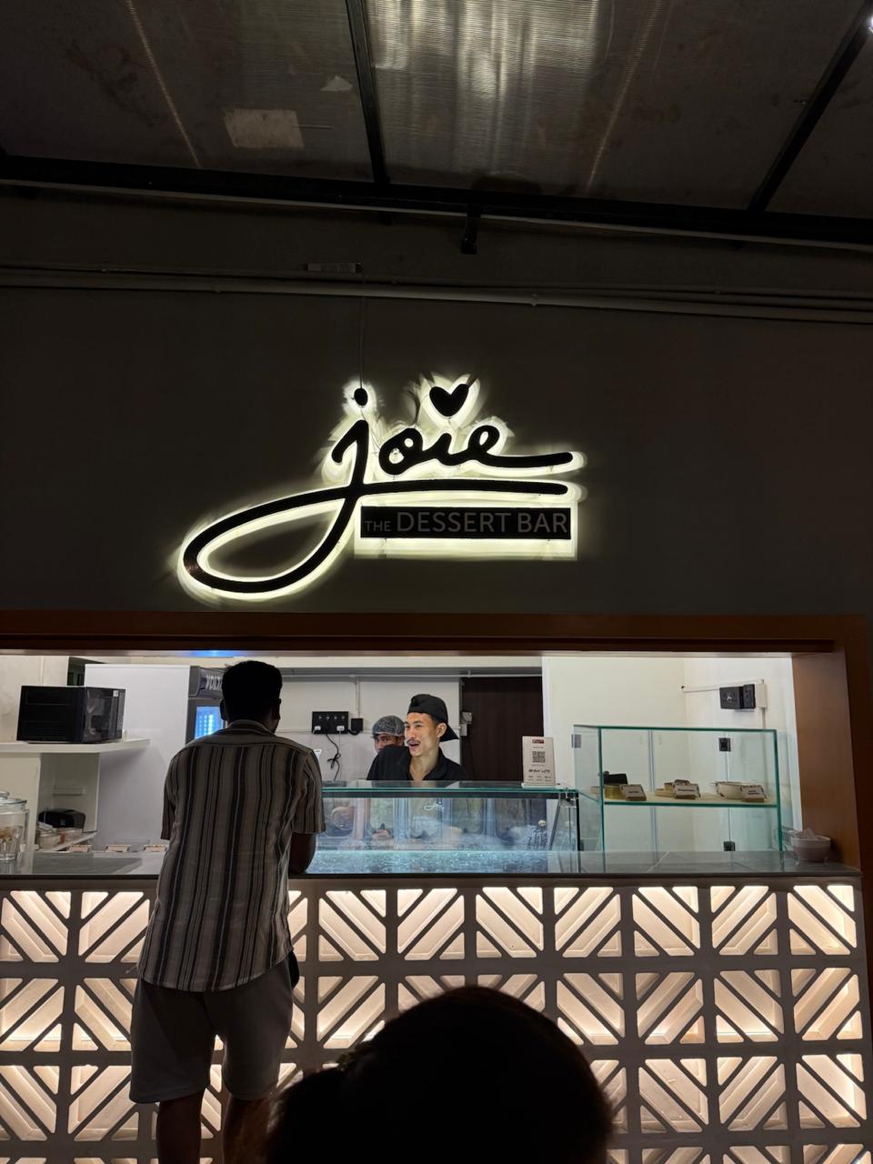
Case image 04
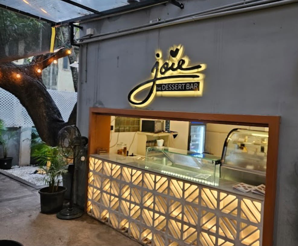
Case image 05

Case image 06

Designing calmer ways through complex systems.

Available for branding, packaging design, product design and human-centered product storytelling.

Chennai · India