
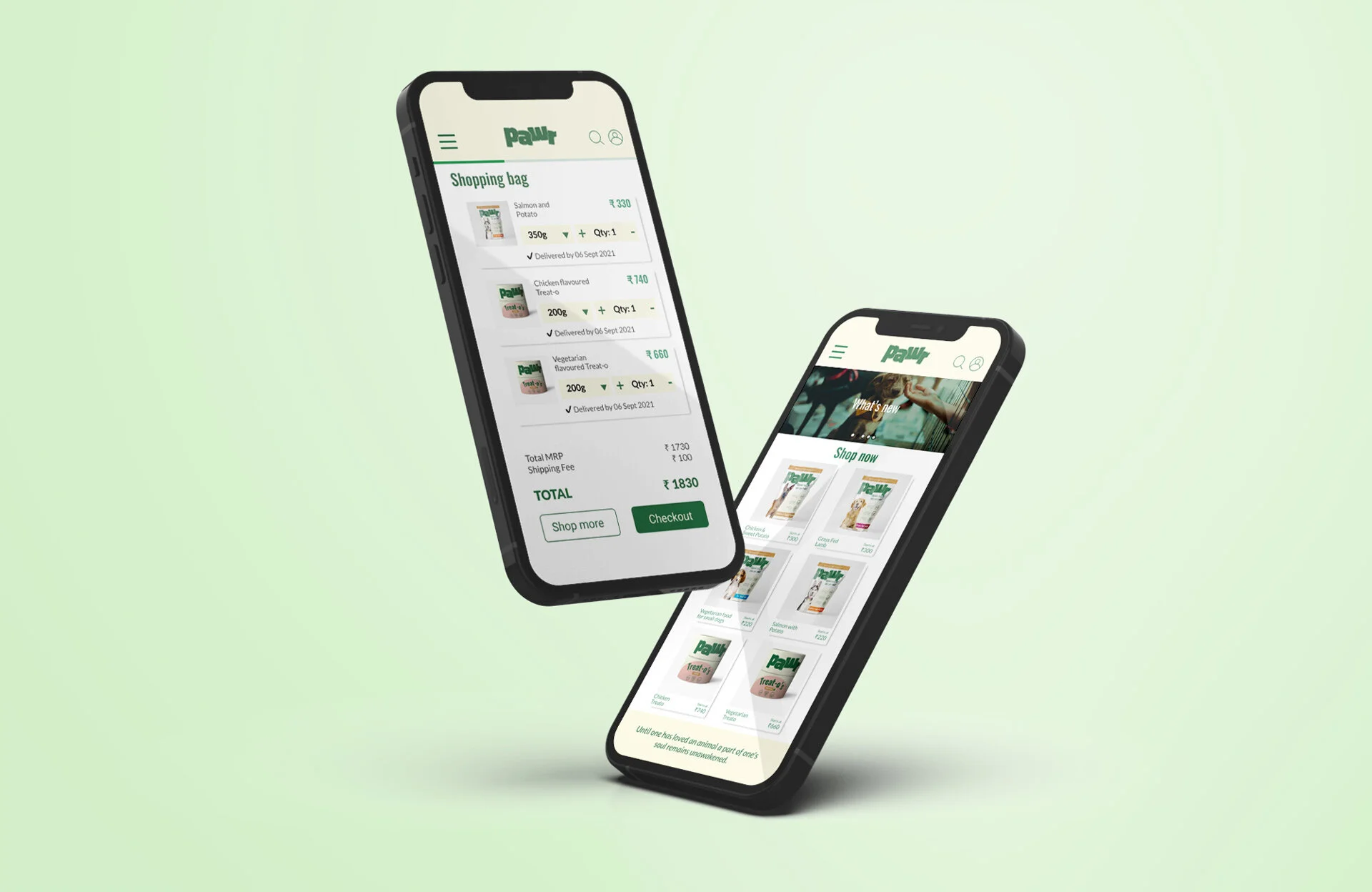
Pawr:
An e-commerce App to Order Organic Dog Food
As part of my Google UX Design Certification program, I designed an easy to use e-commerce app to buy good quality organic dog food.
The Problem
Both seasoned and new pet owners find it difficult to shop for good quality organic dog food.
My Role
UX Researcher and Designer
The Goal
Design an app that lets seasoned and new dog-owners easily order high quality organic dog food for their pets of various sizes and talents.
Responsibilities
UX research, Journey Mapping, Wireframing, Prototyping, Testing, Iterating and Presenting
User Research
I did a series of studies from Empathy mapping, to writing user stories, building their journey, identifying their pain points, storyboarding and finally performing a usability study on the users.
Pain Point 1: Many Options
Many flavours and many different types of options, unable to find one that suits.
Pain Point 3: Lack of Trust
No feedback from other buyers makes it difficult to find out what will work for the user’s dog.
Pain Point 2: Many Steps
Multiple steps in ordering online is frustrating.
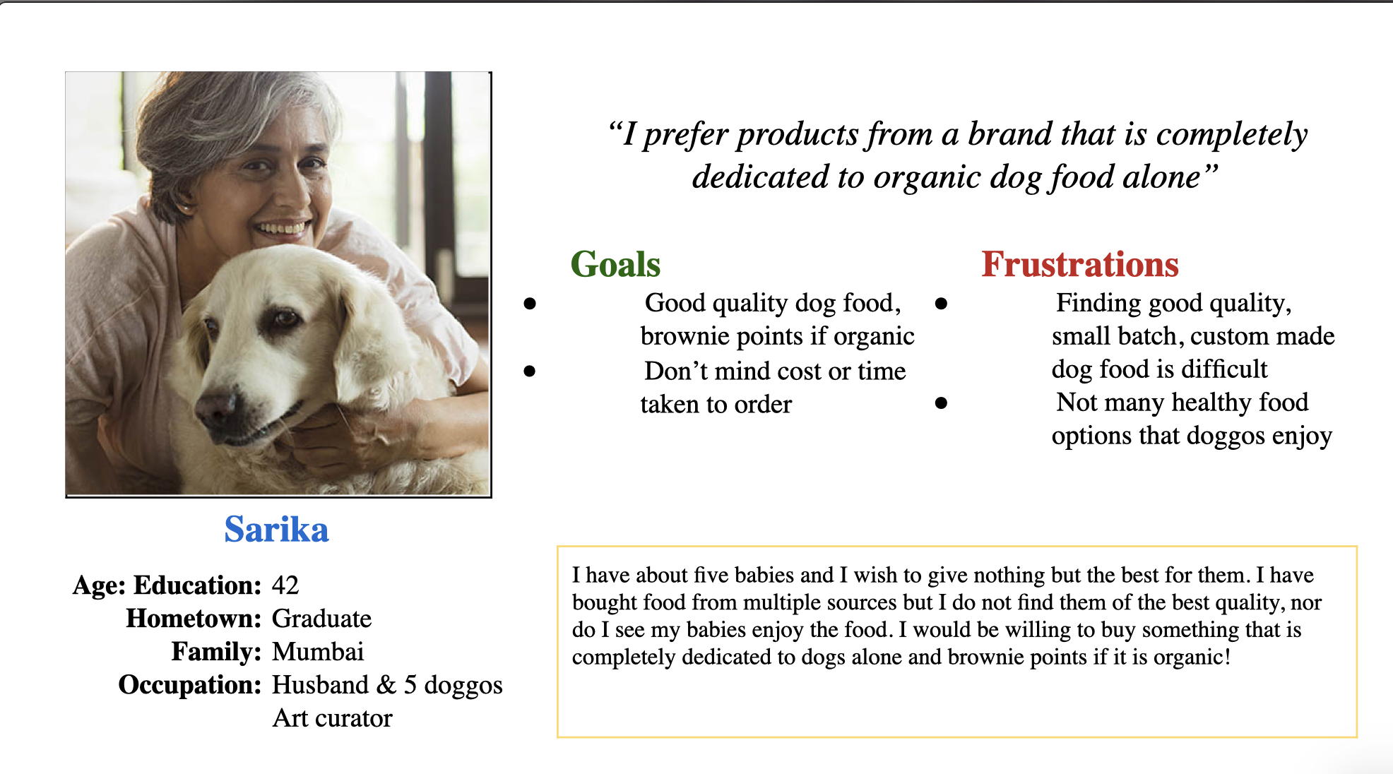
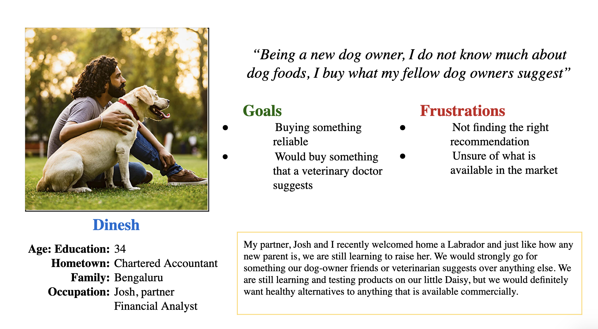

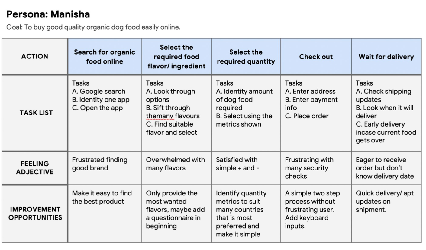
Sample User Journey Map
Above images dept the user personas identified to develop the Pawr app, including a sample user journey map to understand the users.
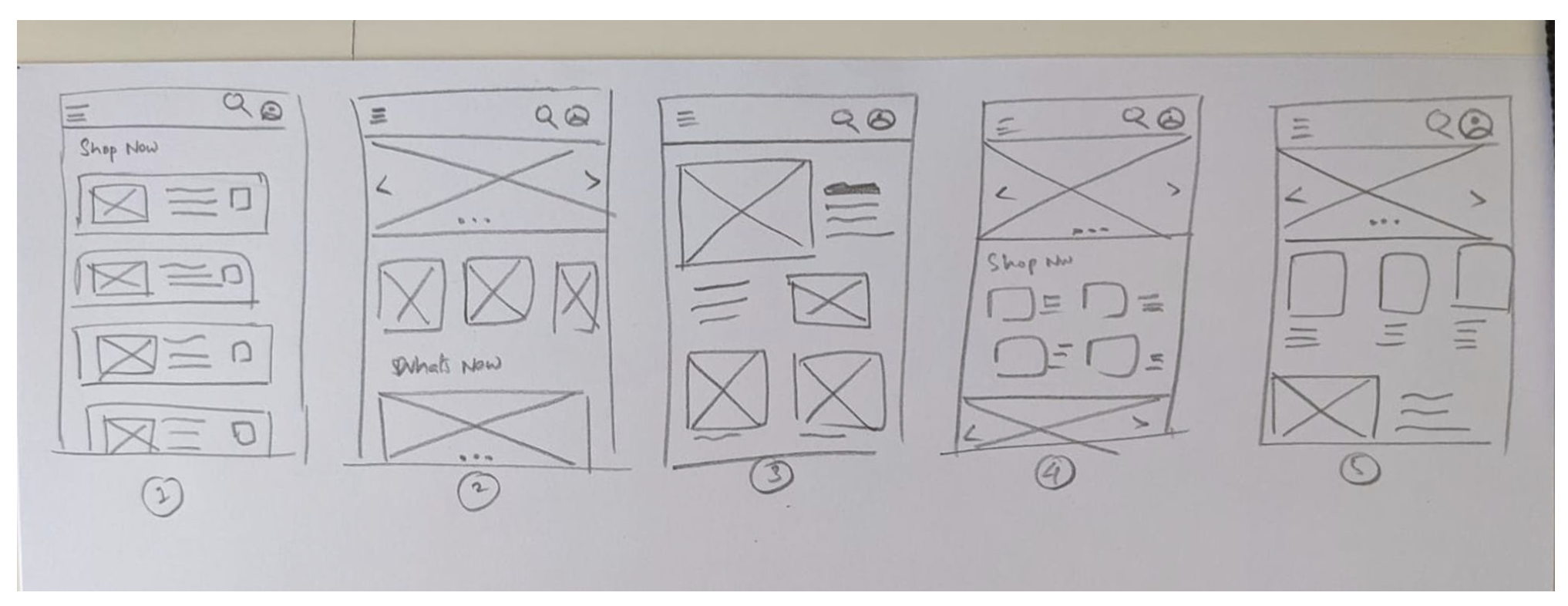
Featured above is the paper wireframe.
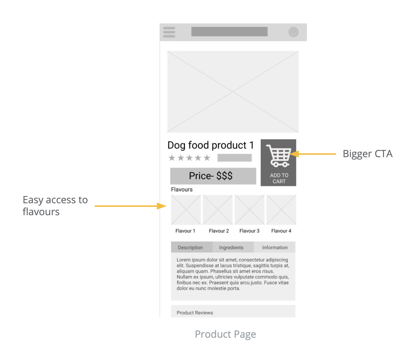
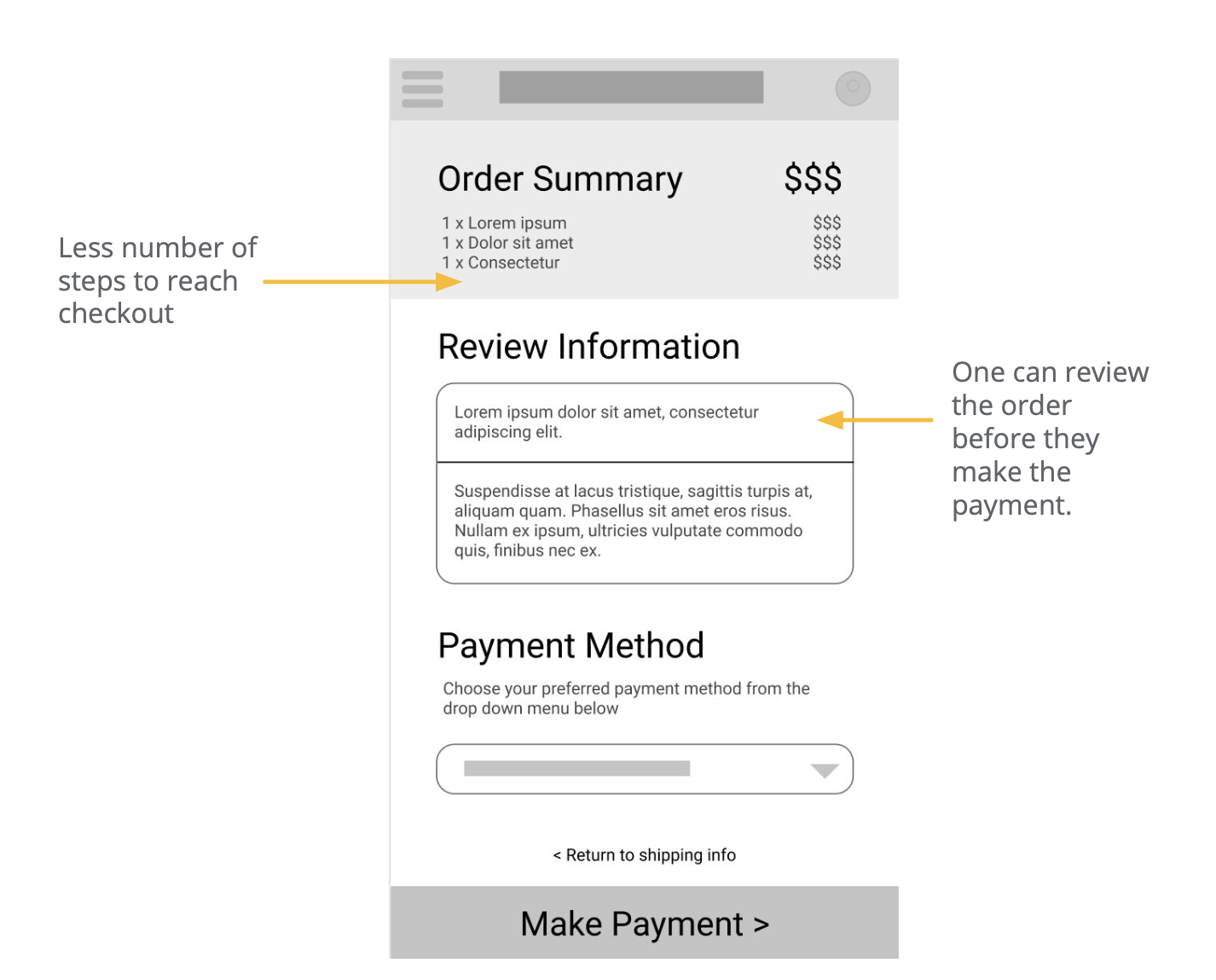
Below are some of the screengrabs of the loft wireframe, including some findings from the Usability test that was conducted.
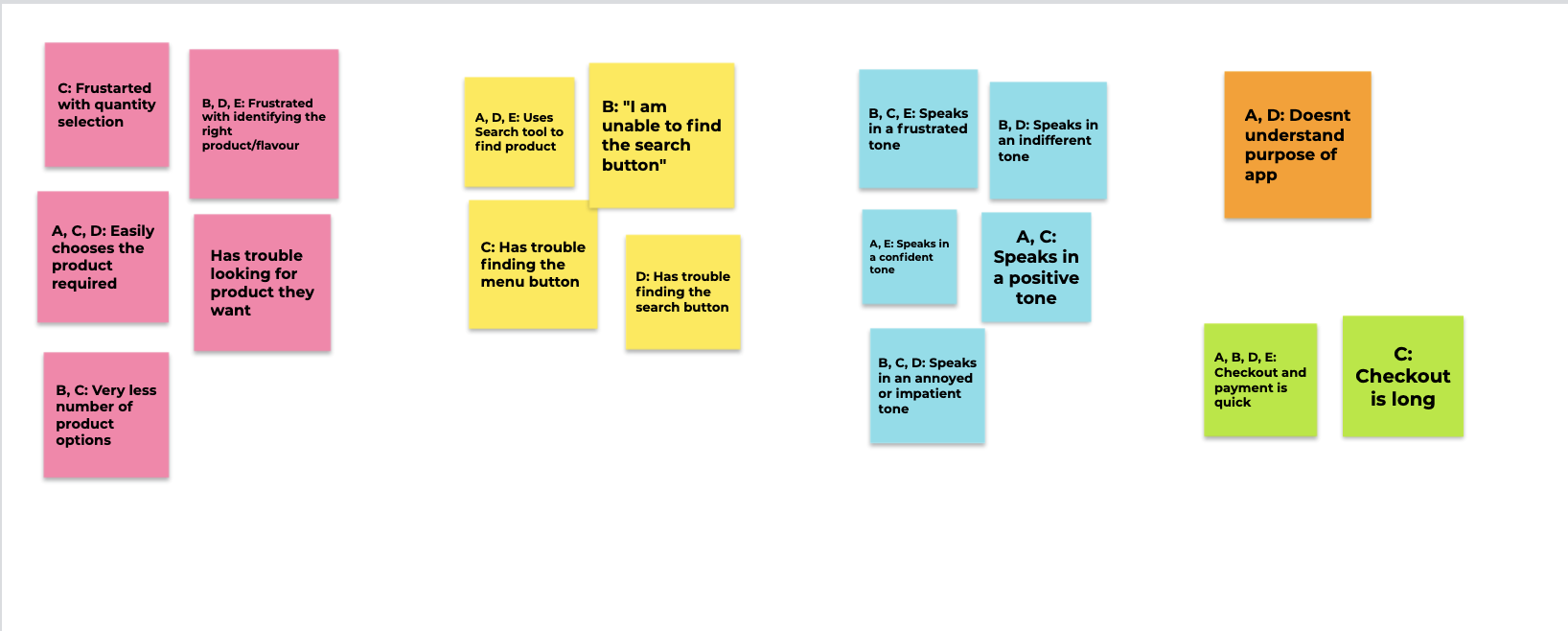
Affinity mapping from the interview part of usability testing.
Usability Test Findings
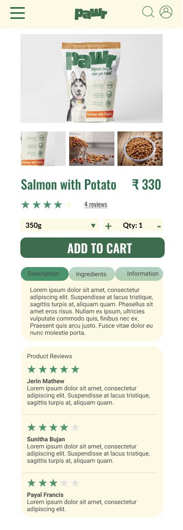
Quantity Selection tool needs to be incorporated
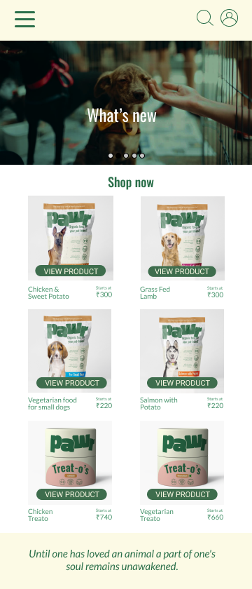
Search Button to be included to find the product
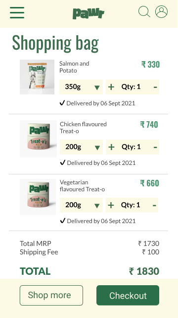
Reduce number of steps to checkout

Before and After showing number of steps involved in the Checkout process.
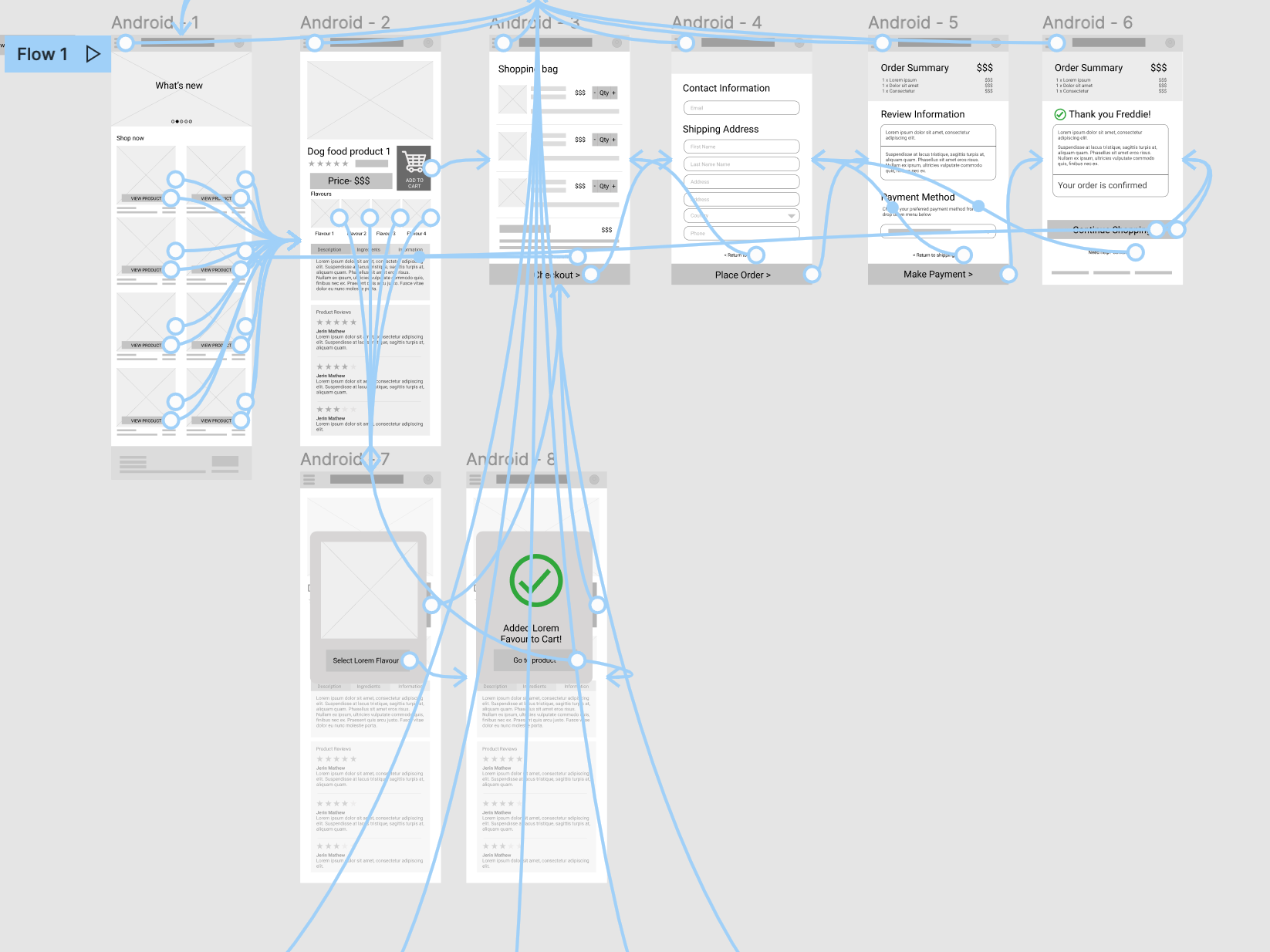
Before: The lofi prototype

After: The hifi prototype


Accessibility Considerations
High Contrast Ratio for easier readability.
Hierarchy and layout is laid out in such a way that it is consistent and coherent.
Hyperlinks are underlined, for example, the Contact Us button is underlined.
Takeaways
Impact:
An app that both seasoned and new dog owners can use to buy the good organic dog food for their pets. With limited steps and recommendations from other buyers, this app will help everyone shop more efficiently
Next Steps:
Expand the app to incorporate more products.
Add a step in the beginning to create a profile for the users’ dogs and suggest food according to their pet type.
Incorporate more accessibility cues
What I learned:
The importance of usability testing and the minute details that we might miss as a designer can be solved by doing an good usability test