Branding for a Luxury Property Developer
Nahata Homes, is a luxury homes division of a popular promoters company based in Kolkata and Chennai. With a deep rooted history in property development and the brand relying on a family mode of business, there were multiple limitations and opportunities present in the branding process.
Challenge & Objective
Challenge
A saturated Market- With many luxury home development brands popping up in a metropolitan city like Chennai, it was a challenge to brand Nahata homes, uniquely.
Objective
To develop a unique and elegant identity that speaks nothing less than the perfect embodiment of luxury.
Research
We did a market study on the kinds of logos prominent in the luxury building sectors in India and identified key features in them. They were minimal, stylish, elegant and, easy to recall.
The Concept
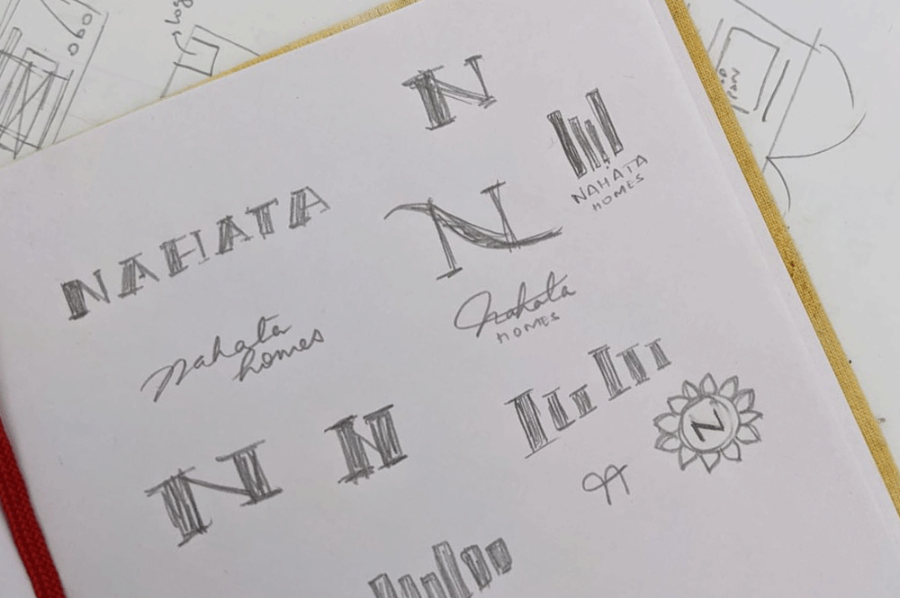
The parent company, PS Srijan, has a strong name in real estate development in the Kolkata region of India. The name, Nahata is a family name and it has a well-built reputation among the same region. First started with developing a typography based identity to lay emphasis on the name, but realised that the letter ‘N’ or abstract emblems of structures with multiple representations could be worked out
N, in the shape of a building would convey the message of Nahata being a real estate developer, but what kind of a building was it going to be?
Identity Options
-

Option 1
A stylised N combined with a stylish sans-serif typeface makes the logo unique. Whether used as just an icon or just the typography, the logo remains memorable as well as standing out from the other building players.
-

Option 2
A serif style typography logo combined with a sans-serif accompanied type makes the logo look like a perfect premium brand logo. This logo is sure to reach out to the right target audience and grab the attention as well as remain memorable.
-

Option 3
A logo inspired by the heritage of PS Group, one inside the other, a leading line that gives a projection of moving forward as well as remaining true to it’s roots. The icon is combined with a tall sans-serif typeface to compliment and remain modern at heart.
Typography & Colour Palette
Colour Palette
Gold, was an ask from the client. I did like it, because it was a true epitome of elegance. Gold- plainly because it is luxury. We iterated with green, meaning growth and fertility as well as blue which signifies trust, that the believers in PS Srijan have been having for many years. Diversified the palette and came up with the following palette.
Typography
It is usual that designers go with a serif typeface when asked to work on something timeless and elegant. But I wanted to give the idea of serif a break and this is the year of disruptive design, so chose to go with a sans-serif typeface. The logo's type is set in Montserrat with some spacing between the letters to bring more pause and add style to the logo.

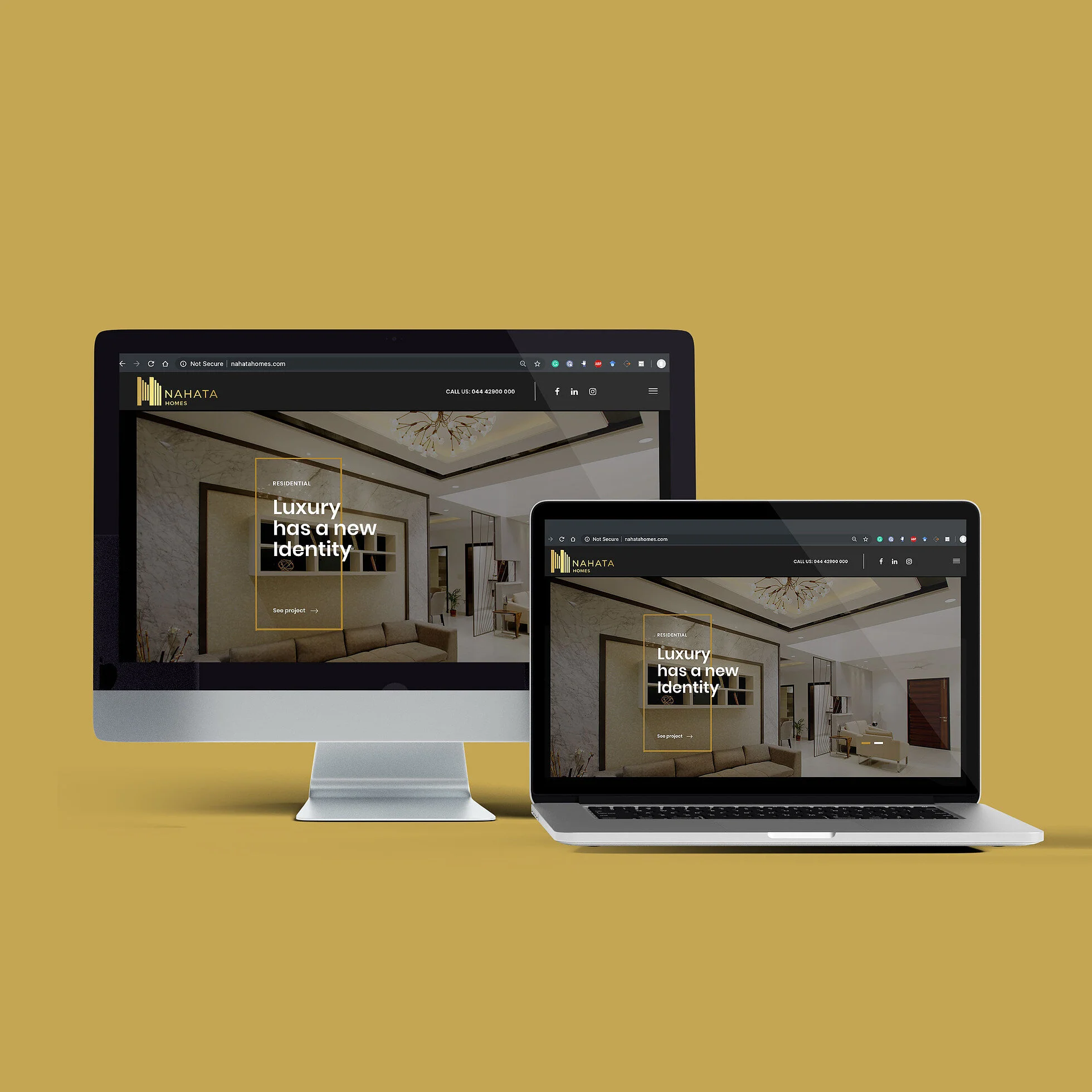
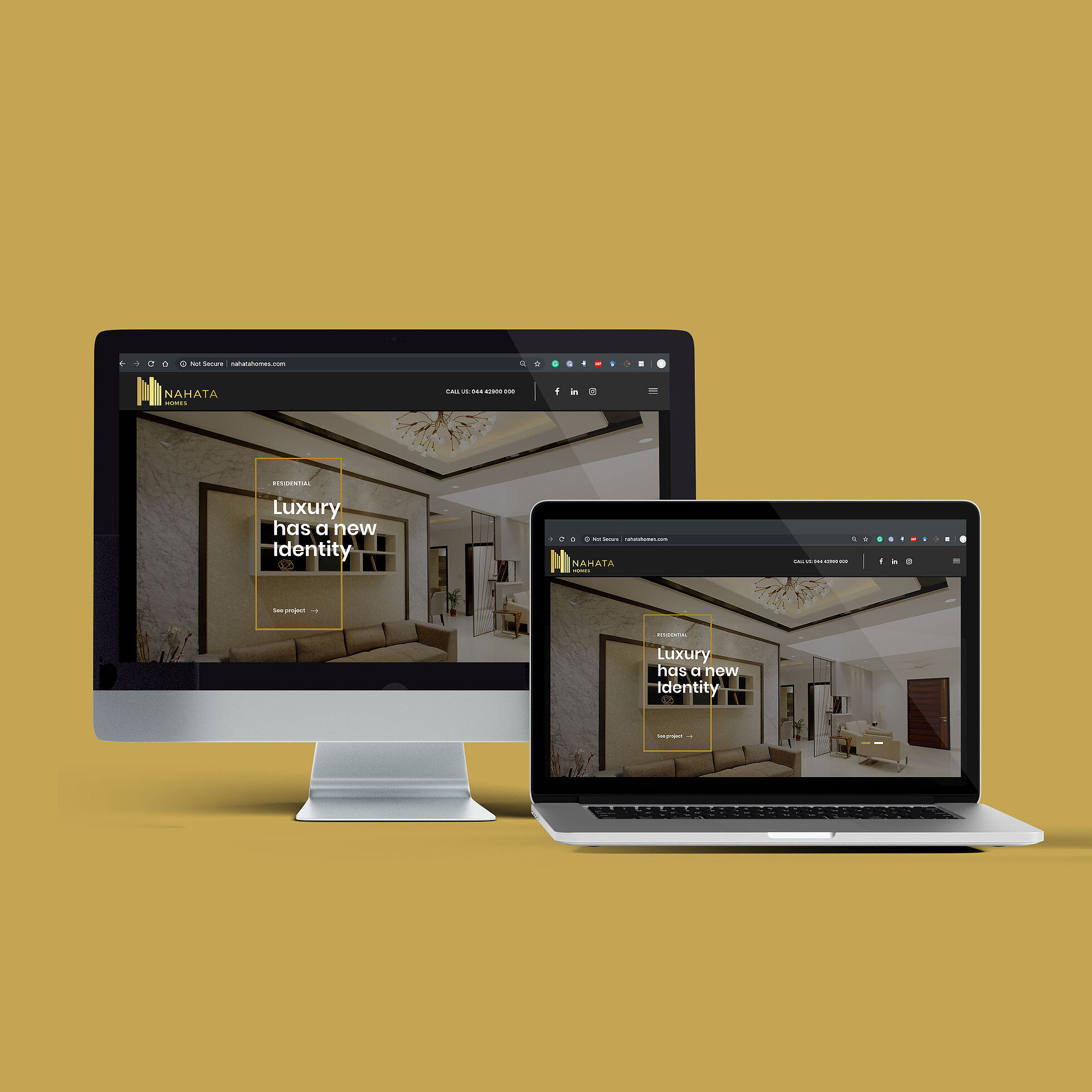
The final identity was a truly contemporary combination logo with an abstract representation of N in the icon of buildings and a completely modern typeface for the text. The logo is sure to remain memorable even when used as separate elements in different visual branding collaterals.