Case study

Designing QuickPay for Senior Nursing Facility Payments

A simplified payment experience designed to help families and caregivers complete senior nursing facility payments quickly, securely, and with greater confidence.

Role

Product design, UX research, interaction design, prototyping

Timeline

7 weeks

Summary

A simplified payment experience designed to help families and caregivers complete senior nursing facility payments quickly, securely, and with greater confidence.

Role

Product design, UX research, interaction design, prototyping

Timeline

7 weeks

Methods

User research, pain-point mapping, wireframing, prototyping, interaction design, feedback-state design

Design decisions

Decisions were documented as a sequence of tradeoffs: what to simplify, what to make visible, where to slow the user down, and where the system should quietly remove effort.

Final solution

The final solution emphasizes progressive disclosure, strong status language, role-aware views, and a visual system that creates trust without adding noise.

Impact

Transformed a stressful and time-sensitive payment process into a clearer, faster, and more trustworthy single-page experience. Metrics: Reduced payment completion time by 40%; designed for completion within 3–5 minutes

Case study

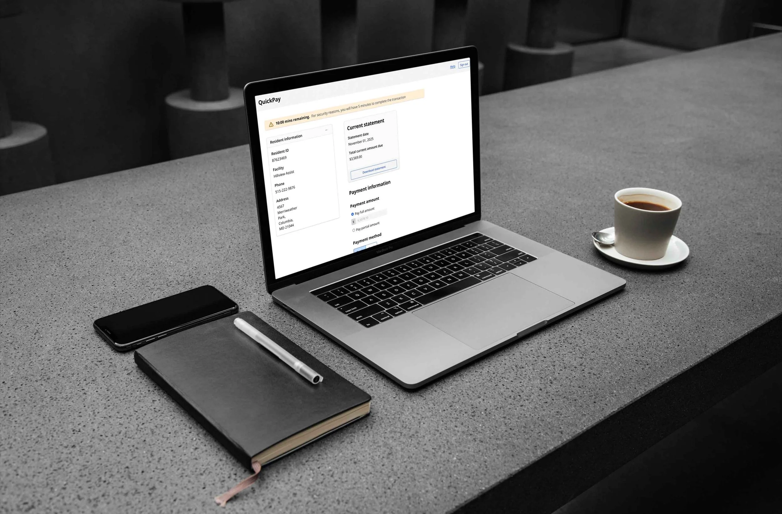
QuickPay was designed to simplify payments for families and caregivers paying on behalf of residents in senior nursing facilities.

The challenge was to make a payment experience fast without making it feel rushed or unclear. Users needed to know who they were paying for, what amount was due, what fees were included, and whether the payment had gone through successfully.

I designed a focused single-page payment experience that kept the resident context, statement amount, payment method, fee breakdown, and confirmation flow visible and easy to follow.

The process focused on reducing uncertainty at every step. I prioritized clear hierarchy, full and partial payment options, bank/card selection, transparent totals, privacy acknowledgment, session timeout handling, and success/failure states.

The core design principle was speed with reassurance. The experience had to help users complete payments quickly while still feeling secure and in control.

The redesigned flow reduced payment completion time by 40% and was designed to support completion within 3–5 minutes.

Additional screens, artifacts, and process details.

Case image 01

Case image 02

Case image 03

Case image 04

Case image 05

Case image 06

Designing calmer ways through complex systems.

Available for branding, packaging design, product design and human-centered product storytelling.

Chennai · India