Case study
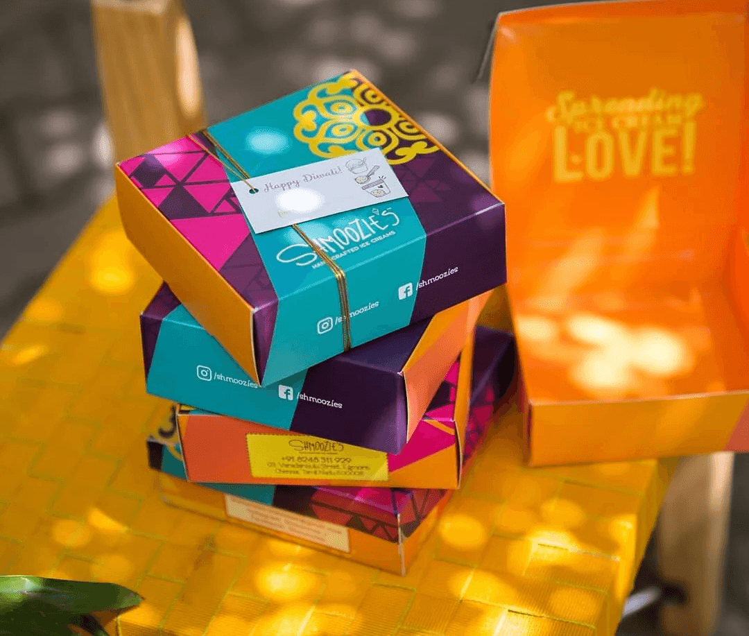
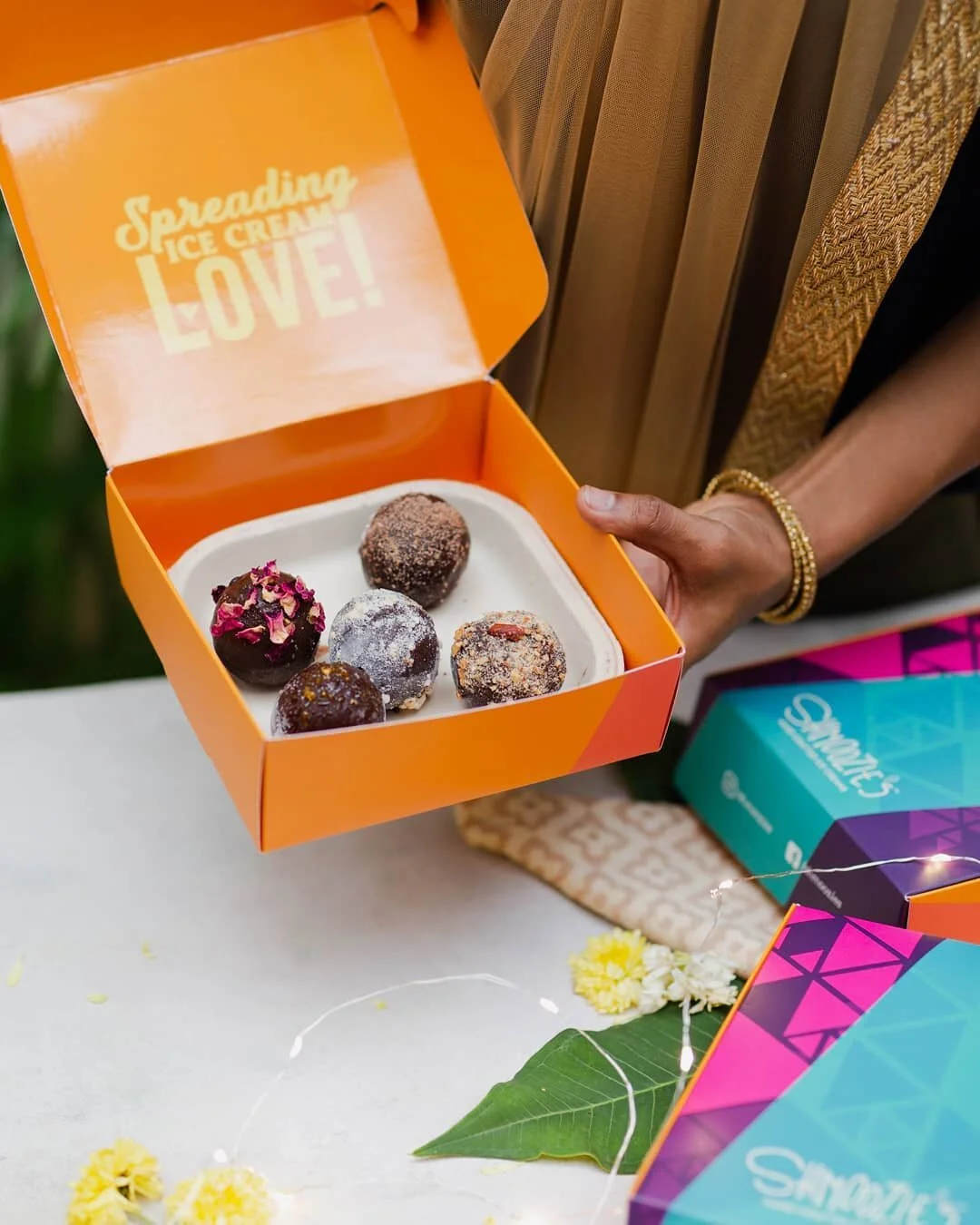
Shmoozies was a playful branding and packaging project for a food product that needed strong recall and shelf presence.
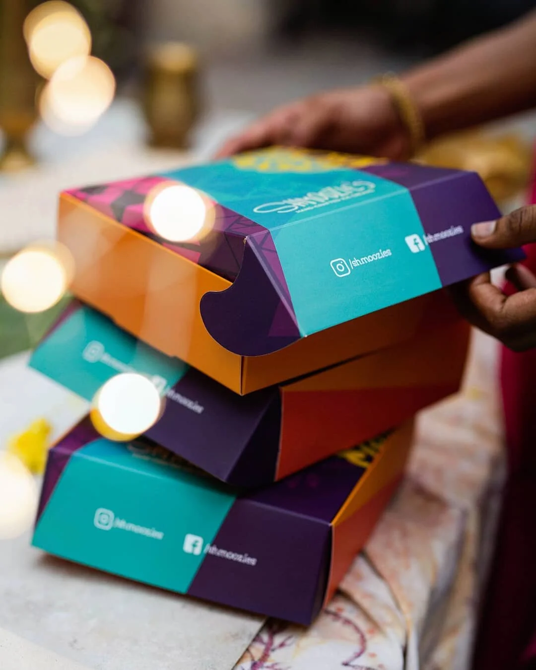
The challenge was to create a brand that felt fun, bold, and instantly recognizable without losing clarity. The packaging needed to attract attention quickly and build a personality that could extend across variants and touchpoints.
My role involved visual identity, packaging design, colour direction, layout exploration, and illustration-led brand language.
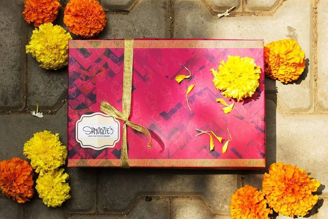
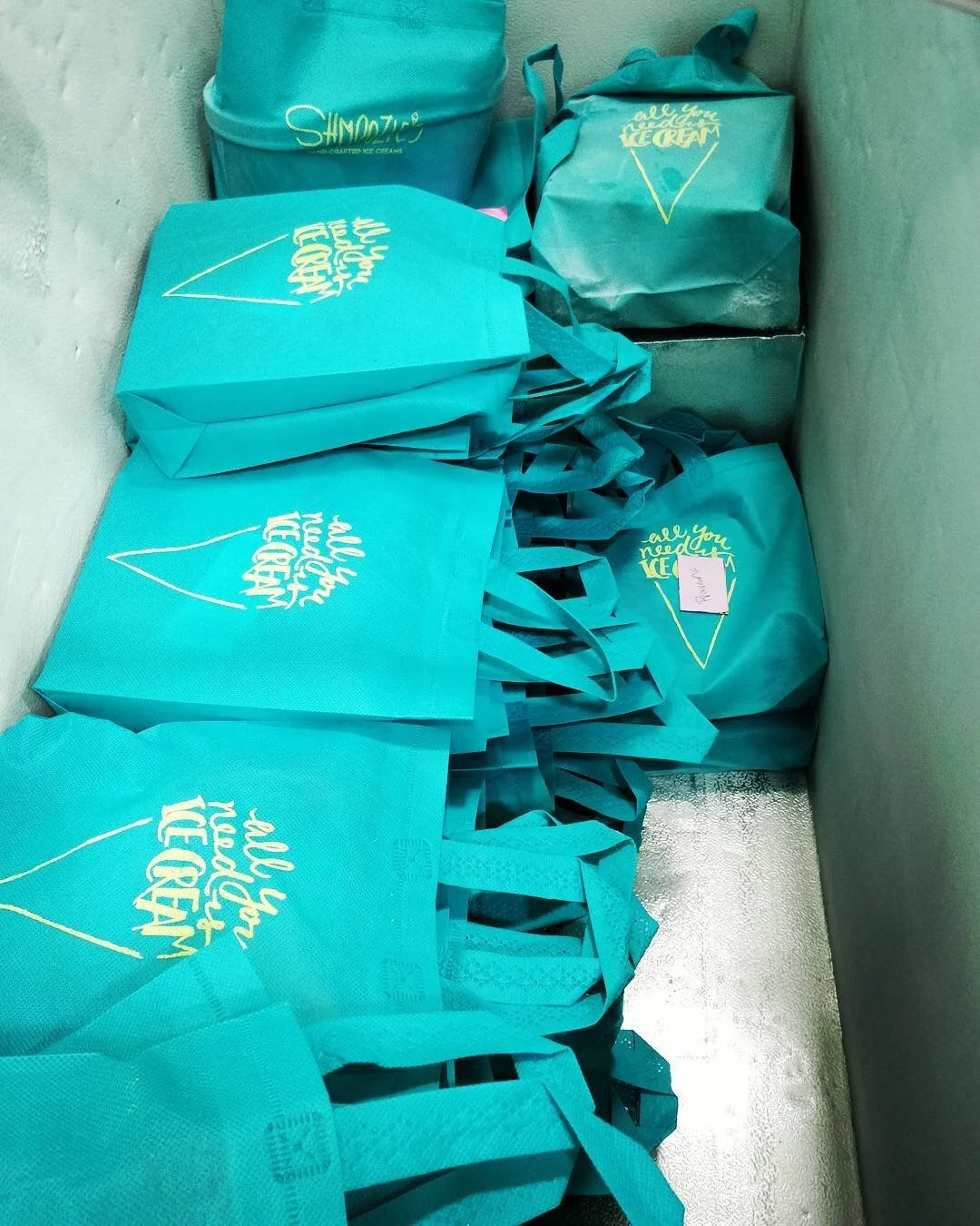
The design approach leaned into expressiveness: bold colours, friendly forms, playful composition, and a visual system that could feel energetic across packs.
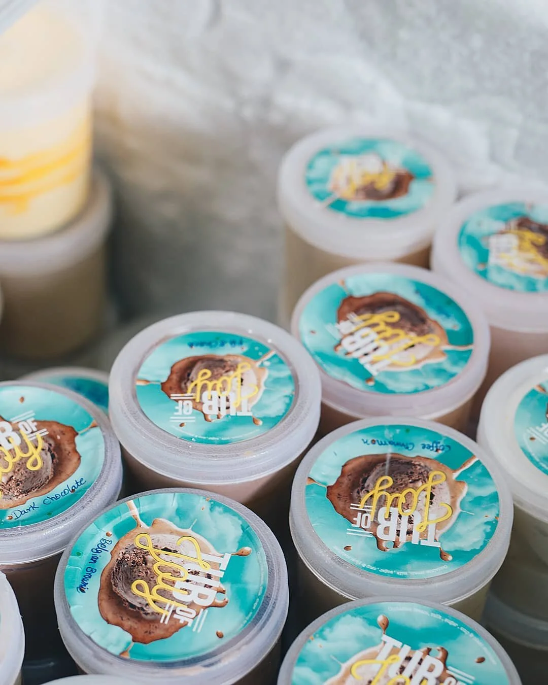
A key decision was to make the packaging personality-led rather than purely product-led. The pack needed to create a feeling first, then support product recognition and variant clarity.
The final direction gave Shmoozies a distinctive and memorable packaging system designed for shelf impact, brand recall, and playful everyday appeal.
Additional screens, artifacts, and process details.
Case image 01
Case image 02
Case image 03
Case image 04
Case image 05
Case image 06