Case study
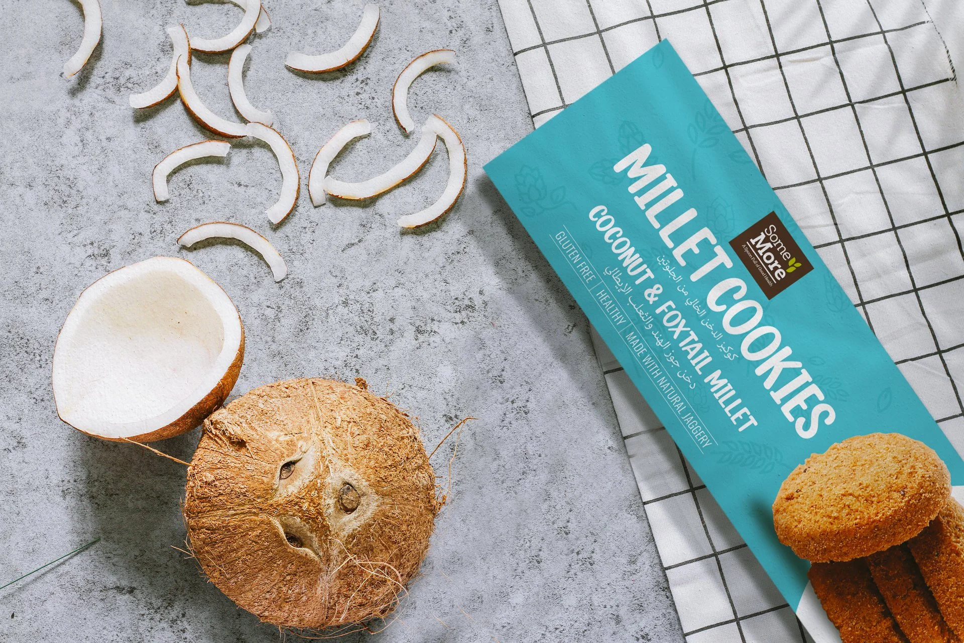
SomeMore Foods’ millet cookies had a strong proposition: healthier cookies made with millet-based recipes and playful flavours.
The challenge was that healthy snack packaging had become predictable. Many brands relied on earthy colours, organic cues, and dense ingredient claims. SomeMore needed to feel healthy, but not boring.
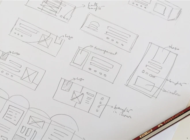
I approached the project as a packaging hierarchy and category-positioning exercise. Through in-store and online competitor analysis, I studied how snack brands used colour, format, typography, claims, and ingredient storytelling.
The design strategy was built around a simple idea: healthy can still feel joyful.
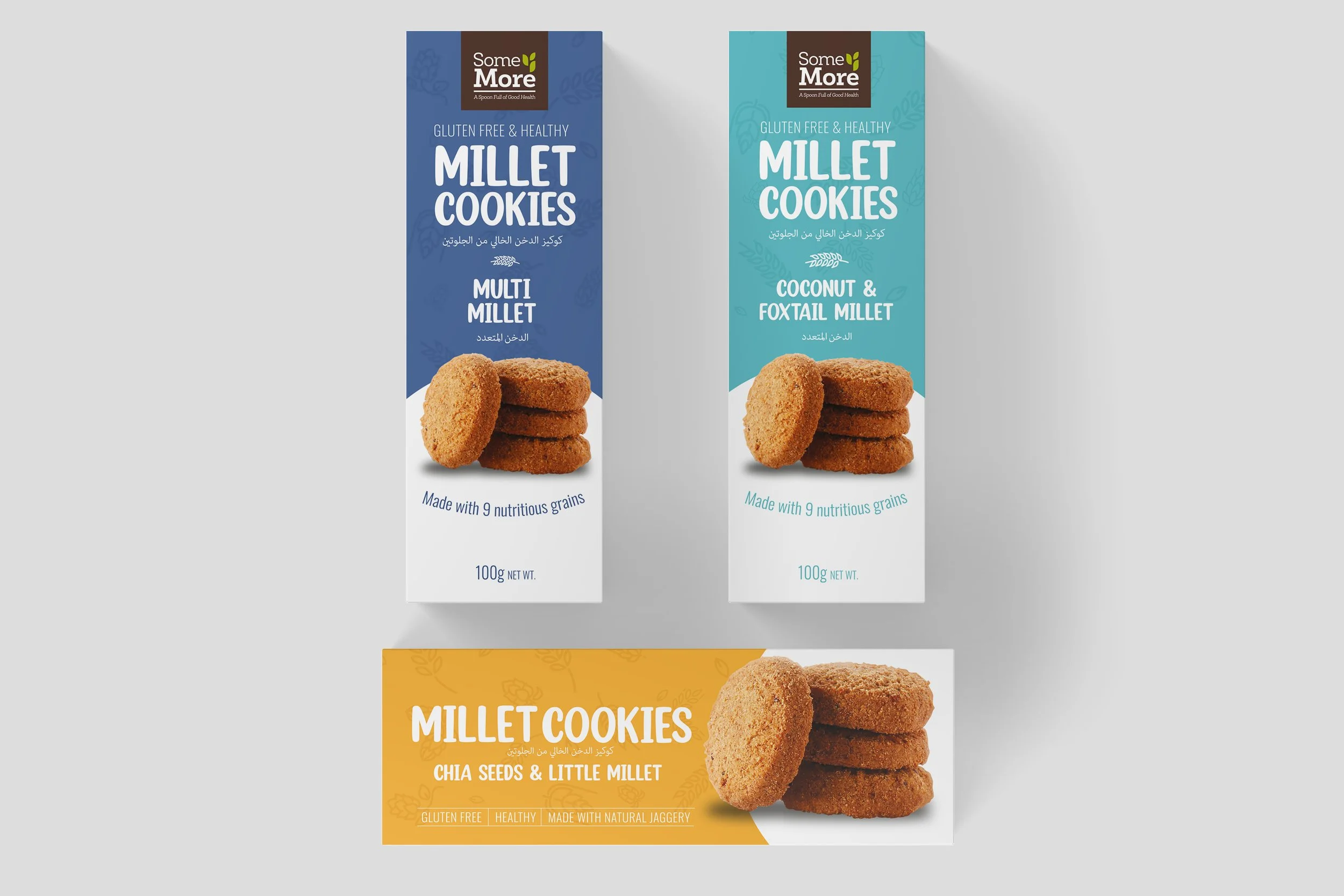
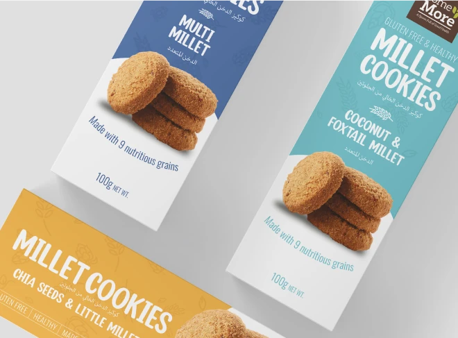
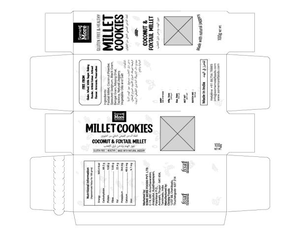
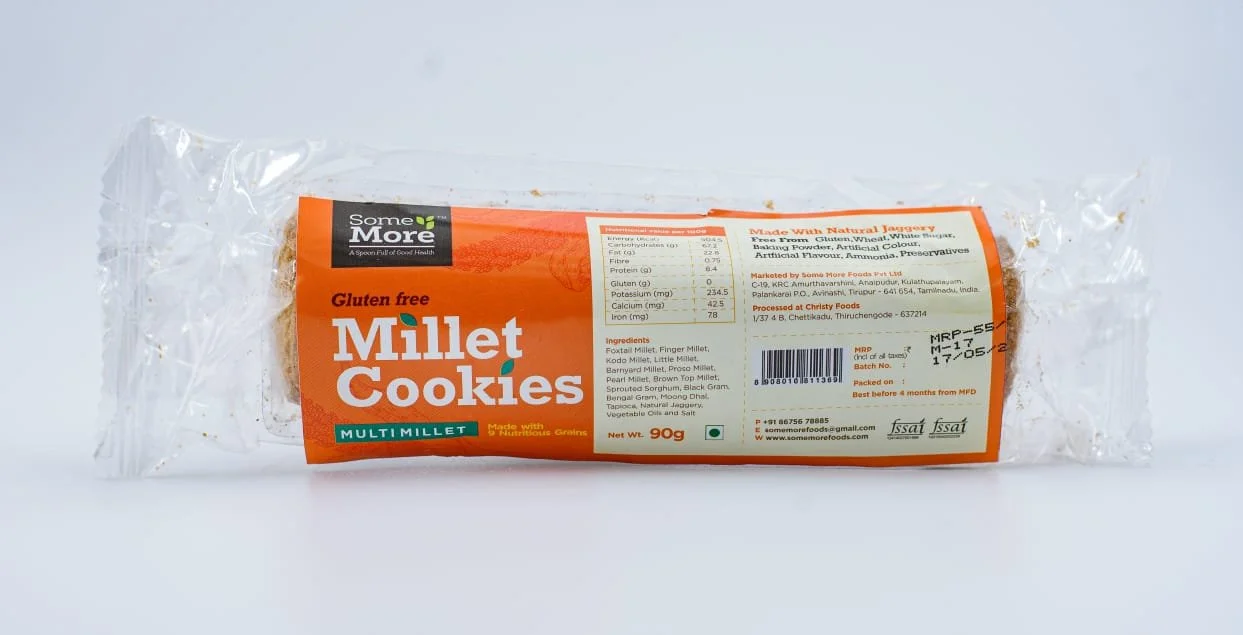
I reworked the front-of-pack hierarchy, used strong variant colours for shelf recall, brought in handwritten typography for a homemade feel, and treated ingredients as part of the pack’s personality rather than just information.
The final packaging system helped the range stand out, communicate millet value clearly, and balance health with taste and warmth.
The project was awarded India’s Best Design Project Award 2022.
Additional screens, artifacts, and process details.
Case image 01

Case image 02
Case image 03
Case image 04
Case image 05
Case image 06