Visual Branding: Shea Ray
A natural and multi-faceted product, Shea Ray organic shea butter is sourced from the Nile region of Africa. The beauty of the brand lies in the identification and extraction of the butter from the source- shea nuts from West Africa, having higher Olien content compared to any other shea butter in the world. I had chosen a branding approach that circles around the authenticity of pure shea butter from West Africa.
Make it stand out.
Objective
Branding for an authentic, organic luxury shea butter product that is to be placed in the Canadian and European markets.
Research
A competitive audit led me to understand that organic shea butter brands were aplenty. Brands in the luxury sector focussed on minimalism and eloquence.
Concept
I wanted to make Shea Ray more of a mark of trust- revolving around it being organic, authentic and luxurious.
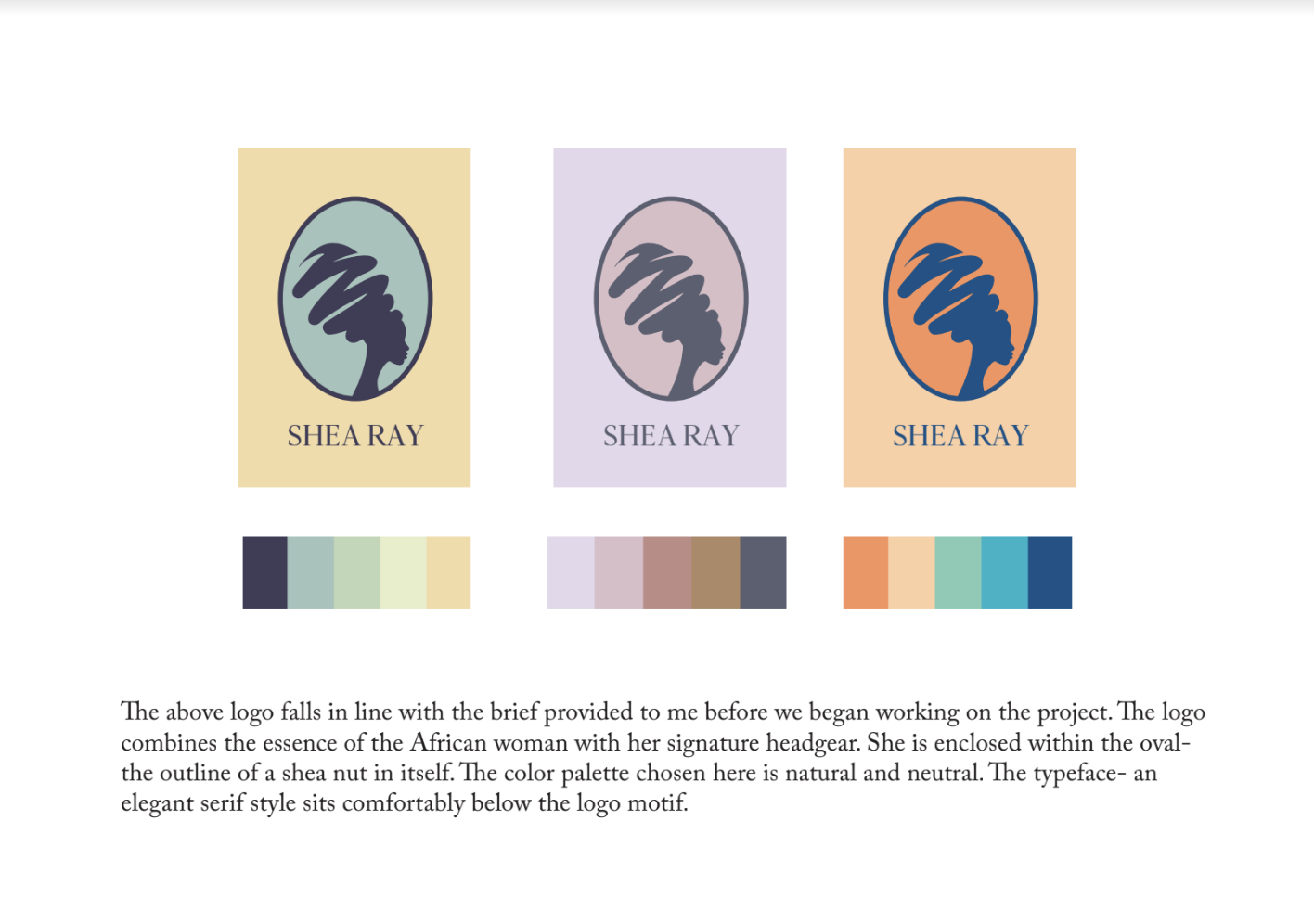
An option proposed for identity.
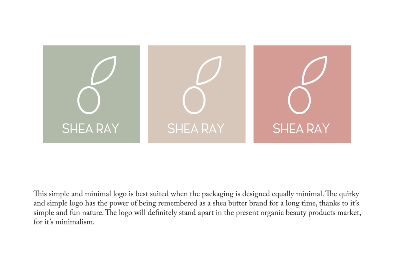
An option proposed for identity.
Final Identity
Identity
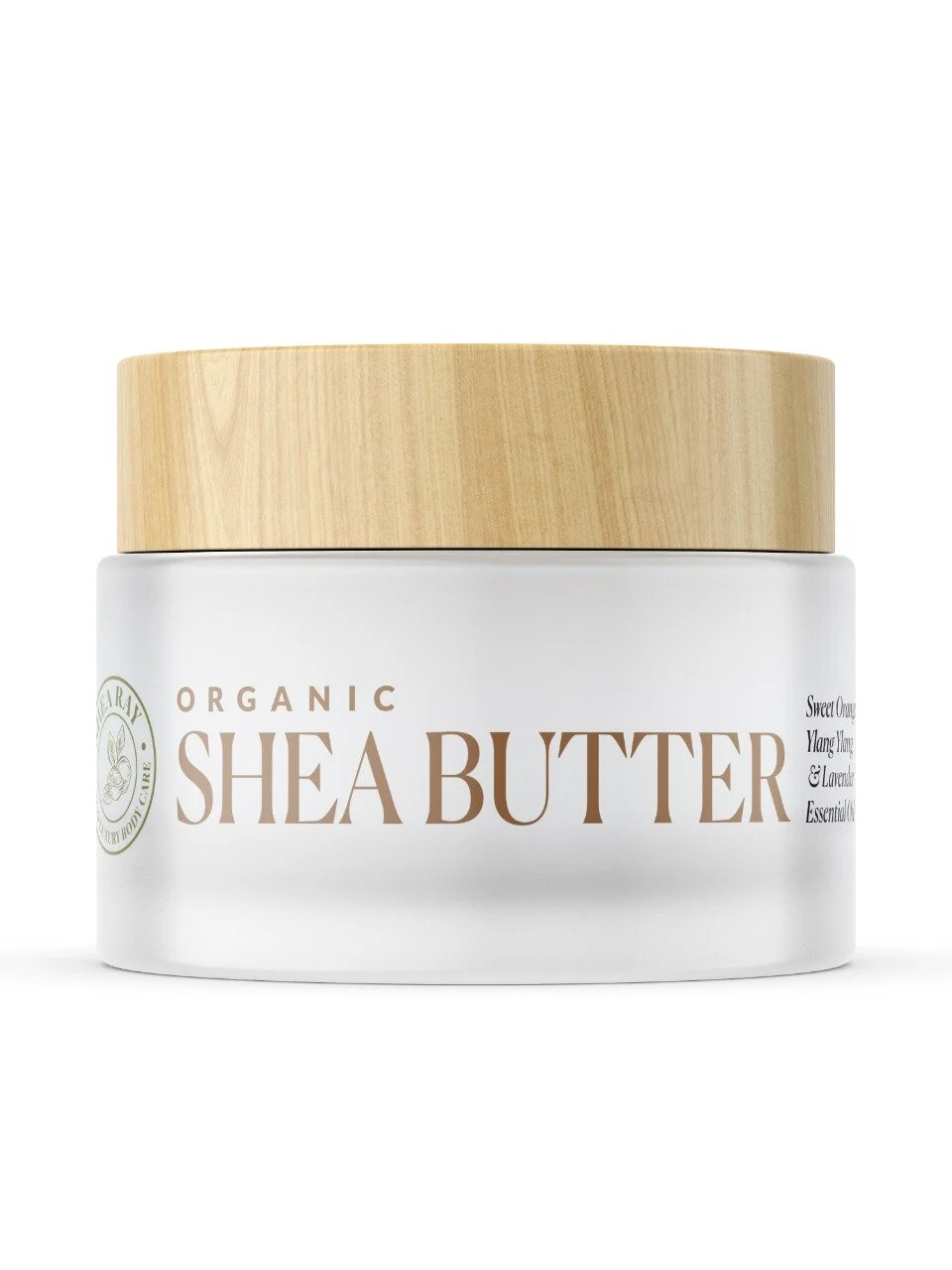
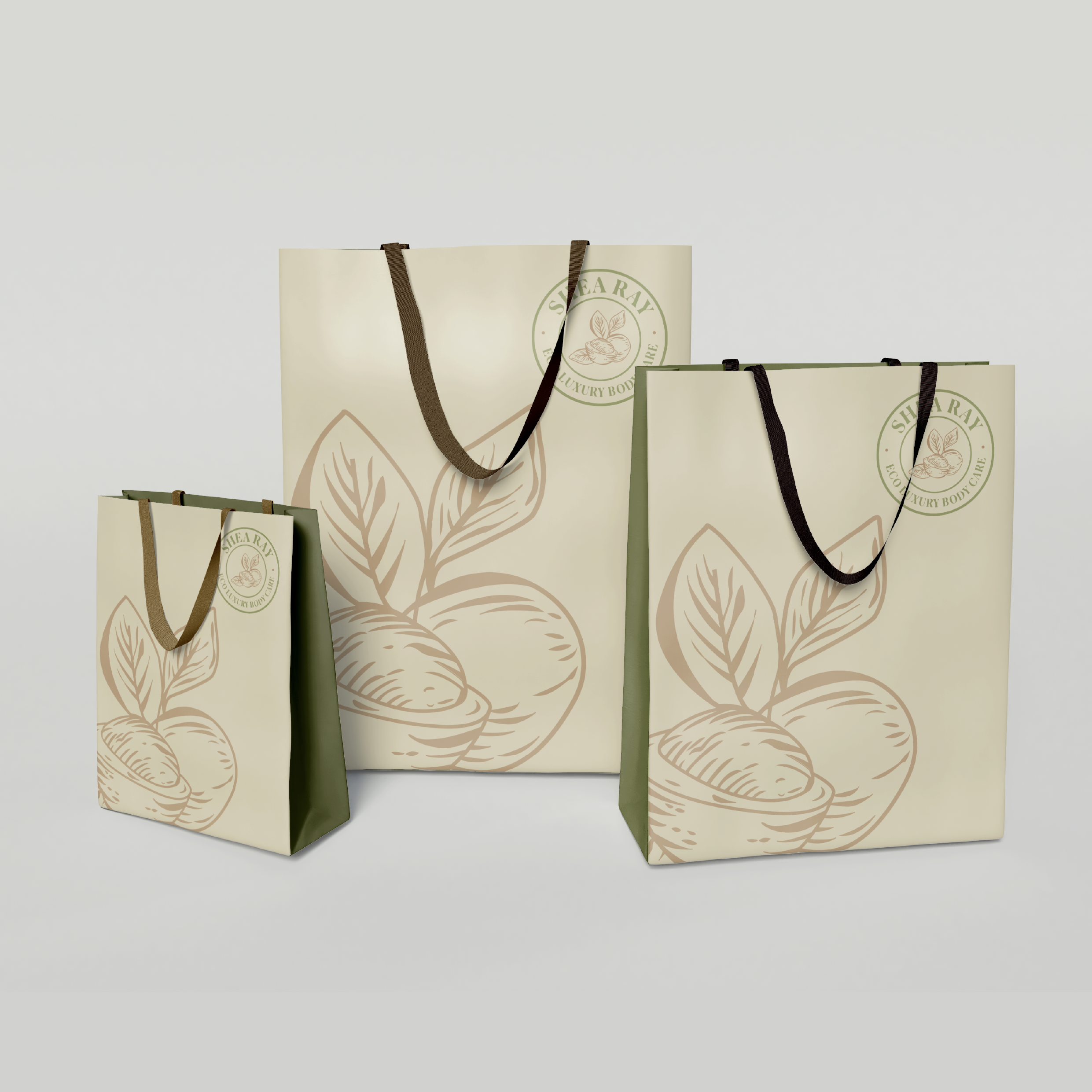
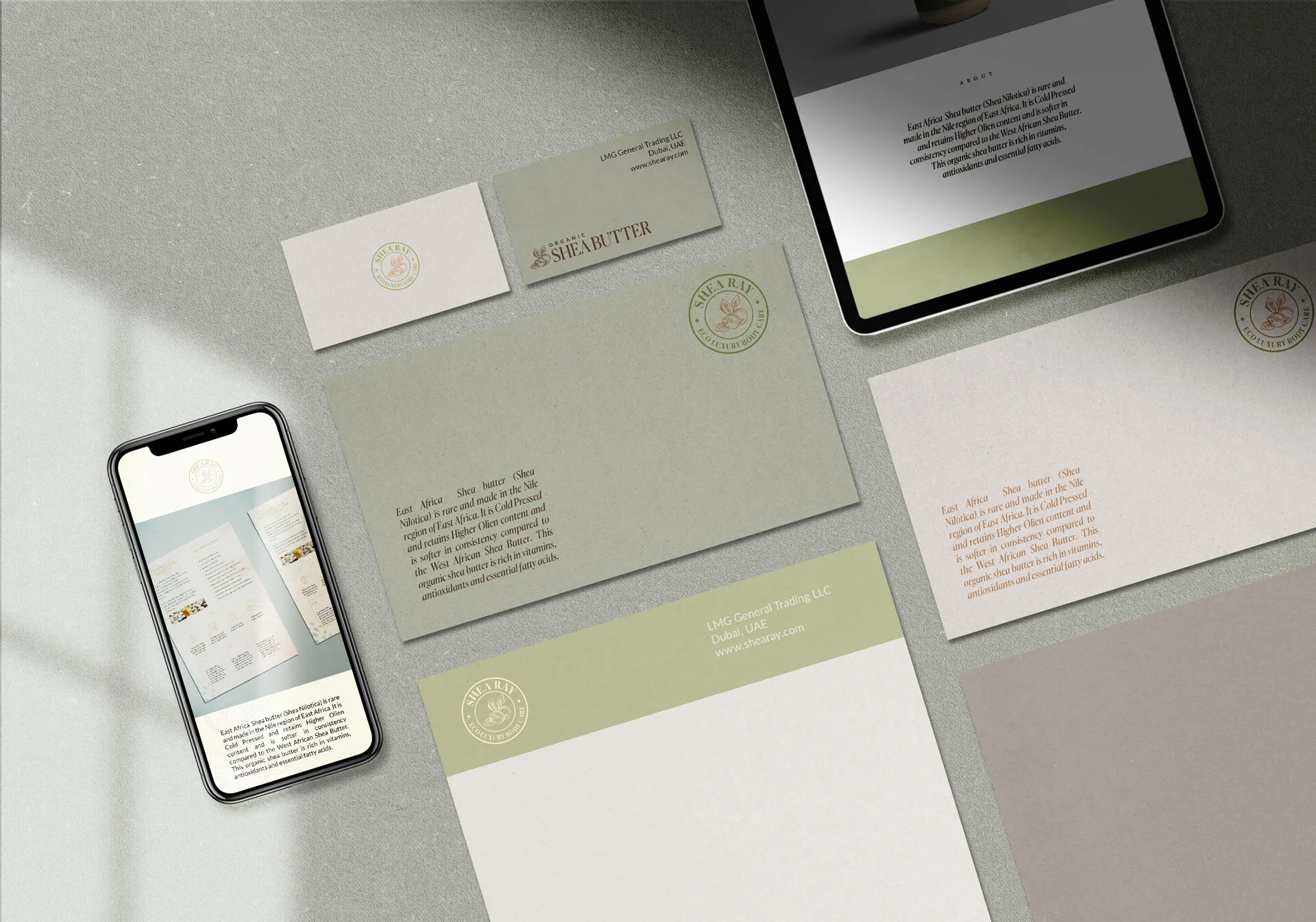
The final identity chosen was a motif that resembles a stamp, that provides a sense of ‘trust’ and ‘authenticity to the brand. The highlight of the brand is the sourcing of the purest butter available in West Africa and the unique identity stands as a testament to the purity of the butter.
Colour Palette
An earthy and pastel color palette in browns and greens was chosen to indicate purity and the closeness of the butter to nature. The variety of Shea butter is called Shea Nilotica. The color palette echoes the earthy browns and greens of the shea plants.
Typography
The typeface was set in Canela, an elegant and timeless classic font. The font embodies luxury and elitism. Canela coupled with the ever-flexible Lato provides a combination that is both contemporary and tied to the roots, just like Shea Ray Shea Butter.